Professional decorators spend longer on prep than on painting itself, and it shows in the finished result. Paint won’t adhere properly to surfaces that are dirty, damp, dusty or oily, so do a thorough check on your room before you start work, moving furniture away from the walls and dealing with any trouble spots. This could mean sanding flaky areas, sealing any damp patches or simply a good vacuuming and washing down, so no dirt gets into your new paint.
At this stage, it’s a good idea to lightly sand down woodwork using 320-grit sandpaper. Then wipe with a damp cloth, followed by a dry one. This creates a key for new paint and ensures a clean, smooth finish.
Prime all surfaces before you start painting. Primers prevent issues like dragging and blistered paint, helping the top coat adhere evenly. Unlike the paint itself, they’re meant to be worked into the surface � if need be, ours can be thinned with water so it penetrates better.
Lastly, don’t paint straight onto newly plastered walls. These need sealing first with thinned-down PVA glue and an undercoat, as plaster’s very porous.
The way you store your paint can have a surprising effect on how well it works. Keep it in a cool (not cold) place and make sure all the tins you’re using are at room temperature before you begin. Paint that’s too cold is thicker and harder to apply; because the pigment’s denser, it can look darker and will cover a smaller area too. On the other hand, paint that’s too warm can lose opacity or blister.
Check that all the paint you’re using is from the same batch � if you’ve bought it in one go it should be, but if not, it’s a good idea to mix both tins together so you don’t get any colour variation.
Then, using a sturdy (and clean!) stick, stir the paint well for a good few minutes. Make sure you have somewhere safe and protected for open paint tins to stand, where you can decant them into your painting tray. It should be easy to reach, but not somewhere you might knock tins over while you’re working.
It’s essential to have all the right kit at hand � and you might need more than you think. As well as the obvious � thick canvas dust sheets, a roller extender for ceilings and a reliable step ladder, for instance � gather the following:
Foam and sheepskin rollers � good-quality sheepskin rollers that don’t shed give the best finish on walls. Have small and large ones, so you can paint both fiddly areas and large expanses easily. Foam rollers are better for a smooth finish on larger areas of woodwork, such as window ledges.
Brushes � again, have a variety, including ones with angled and tapered bristles that can get into small or awkward areas (and make light work of fine details, such as around plug sockets). A big dusting brush is also useful for removing stray bristles, fluff and dirt.
A clean, damp cloth � always have one close by to mop up drips and spills before they dry.
Though it’s tempting to start by covering the walls with colour, don’t; you’ll get better results if you start by tackling the ceiling and work downwards (painting skirting last). Always ‘cut in� around the edges first (a small, tapered brush helps create a neat straight line where the wall meets the ceiling).
Masking tape will protect socket trims and carpets, but you’ll still need to paint the edges carefully, with a steady hand, so they’re as neat as can be.
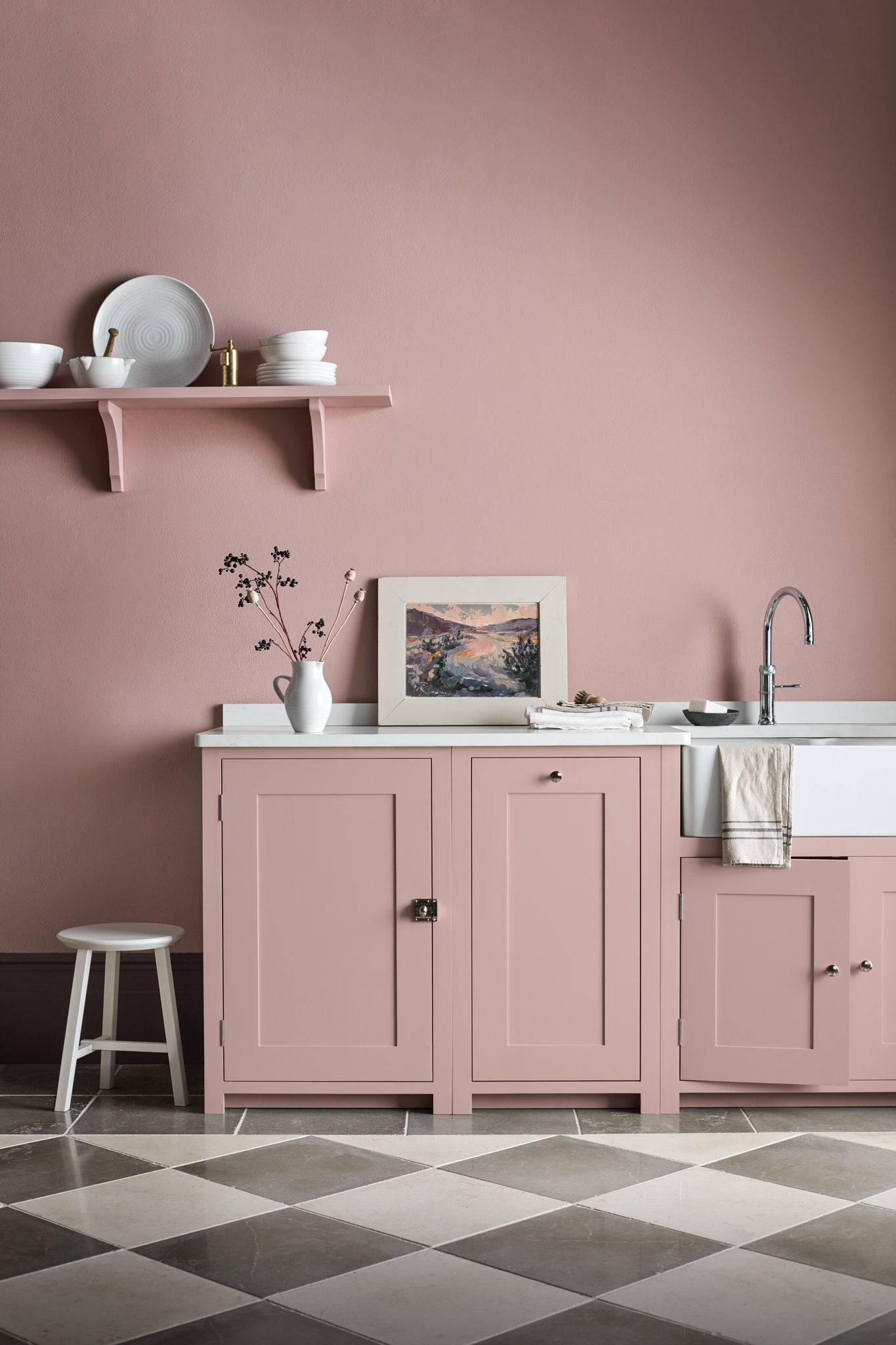
As well as architectural details, there’s lots of other woodwork around your home you can freshen up with paint. Wooden kitchen units and furniture, for instance, are easy to update to change the mood. Lightly sand and clean them (as in step one) and fill any chips or dents with wood filler before sanding again (and priming, if the wood hasn’t been painted before).
Prepare your paint as in step two and apply two thin coats, allowing each to dry thoroughly. This prevents dragging and drips that can spoil the finish.
You can use a roller or a brush � for eggshell on kitchen units though, we think a foam roller gives the smoothest result.
The rules here are much the same as they are for indoor woodwork, although you’ll probably need to sand back old paintwork that’s been exposed to weather a bit more thoroughly to get rid of flakes and cracks.
You’ll also need to ensure furniture’s completely moisture-free before repainting, so bring it indoors to dry out for a couple of days if need be (a fan blowing can help things along).
Lastly, dry new paintwork indoors, not in the open air, where it can blister and attract dirt.
The best thing about painting’s not just that you can change it any time you like, but that if something’s not quite perfect, it’s easy to put right. It’s one of the most fun and creative DIY jobs there is, so enjoy every step if you can.
Explore our edited paint palette.
Ìý
]]>Much like its real-life counterpart, Rhubarb'sÌýa heady shade that creates an impact even in small doses, making it, in our eyes, the perfect accent shade for highlighting features and adding a touch of vivacity to a room. If you wanted to use it on a larger scale, it’ll confidently wrap one or more walls, floor-to-ceiling cabinetry, or an expanse of ceiling in bold colour.
Our honeyed stone shade, Cotswold, provides the warm neutral base to our first palette. We’ve paired it with ¸é³ó³Ü²ú²¹°ù²ú’s striking coral colouring and the darker red of Paprika to create a look with a rich, balanced depth. Doors and their frames, ceilings, and wooden furniture lend themselves particularly well to these two complementary reddy shades. And for a hit of freshness, we’ve introduced Blakeney Blue, our mid-blue hue, as a cooling, contrasting accent.
¸é³ó³Ü²ú²¹°ù²ú’s warm rose and terracotta tones that come to life as daylight dwindles partner perfectly with ³§²¹´Ú´Ú°ù´Ç²Ô’s grounding ‘trueâ€� yellow presence. To soften the look, rather than paint, you could incorporate Rhubarb using our Linara fabric. As such, it’s a scheme that lends itself naturally to a sitting room or cosseting snug. Mid and dark greens, like Cactus and Constable Green, will weave in well if you’re looking to introduce glimpses of natural verdancy.
The calming blue-greens of Moss frame our final palette. It’s one we’ve created with a bedroom in mind, though it would suit a home office or bathroom well too. Cool but never cold, Moss will sit harmoniously alongside ¸é³ó³Ü²ú²¹°ù²ú’s punchier presence, which we’re using as one of two accent shades here. Fine Mahogany, the second, shares similar subtle red undertones with Rhubarb and used sparingly, will bring an earthy sophistication to the finished look.
To start experimenting with Rhubarb and the other paints in our collection, order sample tins here. Or for help that’s tailored to your home, find out more about our Colour Consultancy Service.
]]>With paint, it’s easy to end up with tones that are either too cold or too warm, or to get confused by which white goes best with your accent shade. To remove the guesswork, we keep our palettes scrupulously organised. ‘Our core collection consists of 28 colours, grouped into handy families of four � you can be sure that if you use one shade, there are always three other perfect pairings,� says George, home designer at our Fulham store. At a glance, you’ll spot which quartets will create either a cool or cosy scheme, making it easy to coordinate walls with our bespoke-painted furniture. ‘We also have a seasonal palette that we add to each year, where you’ll find our bolder colour choices,� adds George. These seasonal hues eventually go into our archive, so you can always request an old favourite to spice up a new scheme.
Here, our collection is small, but perfectly formed. ‘For timeless elegance, the Elcot ceramic brick tiles come in four colours designed to complement our paints,� says Jessica, who’s the home designer at our Cheltenham store. ‘There are three sizes so you can create something unique that complements your other design choices. The Kennet marble tiles in brick, herringbone or hexagonal patterns are a more indulgent version.� Like our tiles, the Hepworth linen-effect wallcovering adds subtle texture. ‘It brings warmth to neutral schemes and flatters our wooden furniture,� says Jessica. Finally, there’s Cranbrook shiplap, a modern-rustic, rough spruce boarding that adds natural cosiness, matches any colour scheme and works just as well on the ceiling as it does on walls.
There are nine robust stone floors in our collection, plus engineered wood planks, herringbone and chevron boards in three colours. Because every shade is grounded in nature, they’ll combine to create a sense of flow around your home, and tone effortlessly with Neptune furniture. ‘There’s something to suit every interior,� says George. ‘With stone tiles, you can even mix different designs to create a chequerboard style.� Rugs come in organic materials that chime perfectly with wood and stone. ‘The focus is on different textures � flat weaves for high-traffic areas, and chunky wool designs that feel soft underfoot in relaxing spaces.
Ironmongery is like jewellery for the home, and just as transformative. Ours is inspired by time-honoured designs like classic D-handles, and can make a room feel more polished or more functional according to the finish. ‘There are six choices � from chrome to brass or oak and leather � which evoke every style from traditional country to industrial,� says George.
‘Texture is what gives a home character, and fabric is the easiest way to achieve that,� says George. ‘Our fabrics are edited so everything works in unison, and in harmony with our paint colours.� Natural fibres � wool, cotton-velvet and pure linen � make perfect sense together and create sensual contrasts. Patterns are always unfussy, with a choice of understated florals, stripes or geometrics. ‘Some are small repeats, others more expansive, but all live happily together.�
Explore our decorating collection online here, where you can also order paint samples and fabric swatches. For samples of our flooring, wall covering and hardware, just heads to or get in touch with your nearest Neptune store.
]]>Rooms that face north typically get a lot less light overall. The light that does filter through also tends to be on the cooler side. Because of this, it’s best to pass up paint colours with grey or green undertones in favour of those with warmer ones. If you’re looking to keep things neutral, yellow-based shades (like Old Chalk and the rest of the Fossil palette, or Cotswold and Calico from our archived Earth palette) will help to bounce the little light you do have around the room.
Alternatively, you may want to embrace the darker aspect, and opt for a much deeper shade. Saturated colours will come across even darker in north facing rooms, so here’s your chance to create a truly cosy, cocooning space. Clove, Walnut, Peat, Juniper, and Fine Mahogany are all great contenders for the job.
In contrast to north facing rooms, those that face south enjoy strong natural light throughout the day. Most colours, whether cool or warm toned, will work well (although they can appear yellower because of the warmth of the light), so it all depends on the look and feel you’re going for. If you’re hoping to balance the strength of the sunlight, cooler shades, and those with blue or green undertones like Alpine or Aqua Blue, are best. Red-based neutrals, meanwhile, are particularly effective at enhancing the warm and cheerful outlook of south facing rooms. Our Salt, Silver Birch, and Driftwood paints all share this reddy base.
If your room is east facing, you’ll enjoy a bright start to the day, with the light lessening (and cooling) throughout the afternoon and evening. This cool evening light can work to your advantage if you’re looking to create a calming sitting room or bedroom for unwinding in later in the day. Keep to soft blue and green paints without too much grey, such as French Grey, Sage, Flax Blue, or Powder Blue, and it shouldn’t feel too cold. Alternatively, red and orange tones are a natural choice if you’re looking to counter the coolness in a dining room or sitting room. Paprika, Burnham Red, and Burnt Sienna all fall into this camp and will create a warm and welcoming feel.
With cool, subdued light in the morning, west facing rooms experience plenty of warm light by early evening. If you have a west facing room that’s used from the early hours of the morning and on into the evening (such as a study or kitchen), red and pink toned paint colours like Paprika, Old Rose, and Silver Birch will help to cast a subtle warm glow in the absence of sunlight and then enhance it later on. If it’s a room that’s used most later in the day, and you’re a lover of a neutral palette, try cooler tones like Shell or Snow. They’ll feel fresh early on but then neutralise in the evening by the warmth of the natural light.
Discover all the colours in our paint collection onlineÌýhere.
]]>