/blogs/stories.atom Neptune - Stories 2025-08-11T15:14:02+01:00 Neptune /blogs/stories/quality-assured 2025-04-10T15:58:06+01:00 2025-04-10T15:58:15+01:00 Quality assured Chloe Oakley The way we design, craft and make our furniture means we can offer a lifetime guarantee on all our furniture.

More

]]>
The way we design, craft and make our furniture means we can offer a lifetime guarantee on all our furniture.

There is a philosophy that runs through Neptune’s design and making processes that made introducing the new Lifetime Guarantee to our furniture collections possible. Co-founder John Sims-Hilditch sums it up best, ‘From the start, I felt that if we were going to make furniture that was going to last indefinitely, then we’d needed to make the right decisions around the materials, how they were designed, and how they were engineered and made. Our first decision was never to use MDF or chipboard because we could see they didn’t have the longevity that we would want.�

The materials

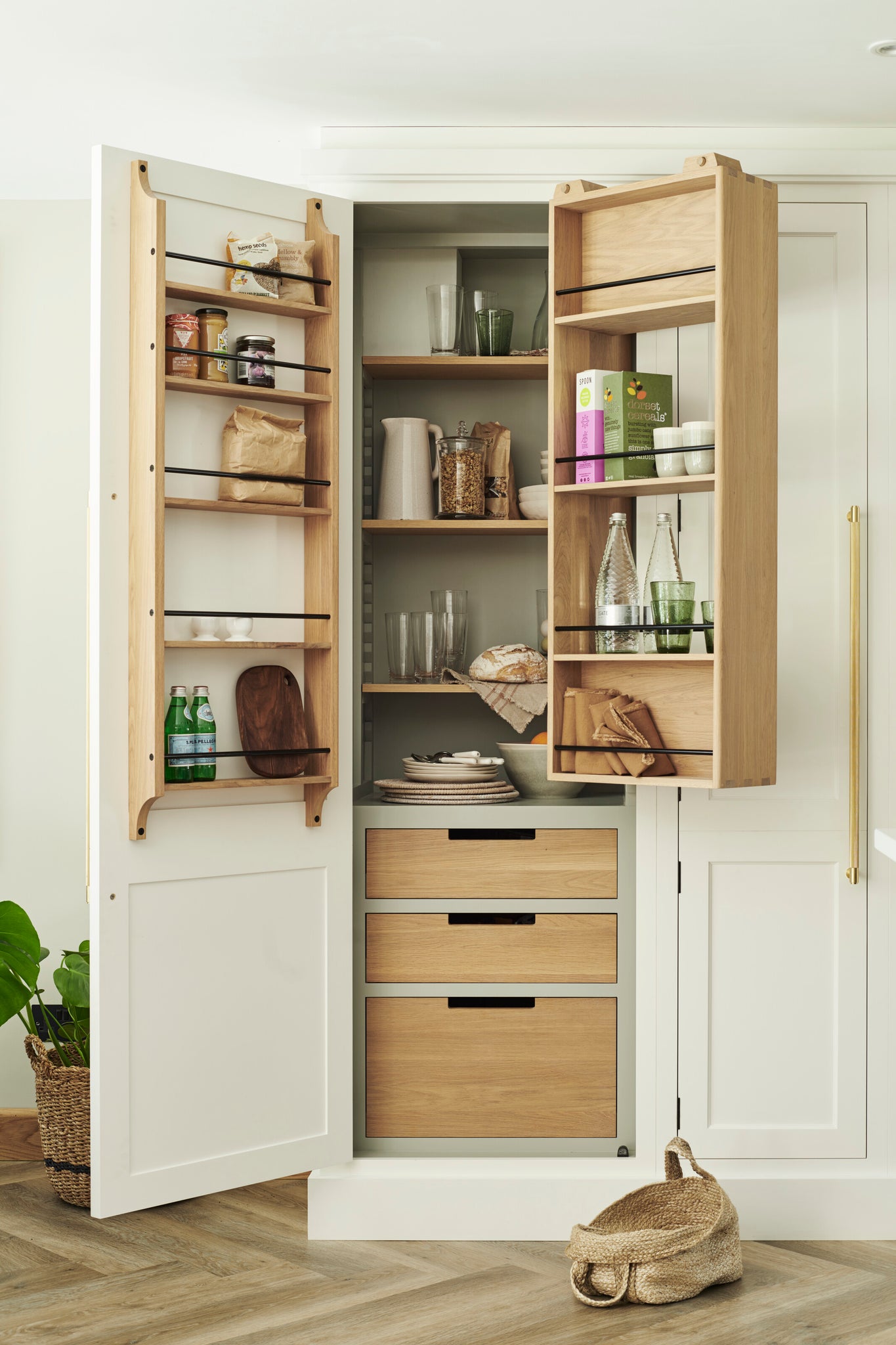
Nearly thirty years on, this commitment to long lasting craftsmanship remains. Solid timber forms the heart of Neptune collections, from sofa structures to trestle tables. ‘Oak has a long history in British furniture making,� explains John, ‘it is incredibly strong but also naturally beautiful.� Teak is good for outdoor furniture thanks to its protective high oleo resin content, and tulipwood for painted pieces because it has a smooth surface that carries paint well. Birch plywood is used for inset panels on cabinetry as it gives doors a rigid dependability without being heavy. And even solid tables like the Arundel and Suffolk are designed with central panels of cross-bonded oak to create a super-strong structure that won’t warp over time. ‘No one else uses this technique because it is hard to do, but it dramatically improves the life of the tables, so we believe it is worth it,� explains John.

Craftmanship 2
Craftmanship 3
The design

With the materials set, the starting point for any Neptune design is to look to antiques � those very items that themselves have lasted for generations. Design lead Mike Charlton crafts mini balsa wood models that allow him to see his ideas in 3D. ‘The models allow me to play with the shapes and joints and refine them easily,� he explains. ‘A good model can tell you so much about a full-size piece of furniture, not only in its aesthetic but also in its strength and structure. If I designed the same piece of furniture on a computer, it would be more formulaic, designed the way that the computer has been programmed to work. There are no such restrictions when you use your own hands and physical timber.�

Craftmanship 4
Craftmanship 5
The making

‘No one is going to reinvent the dovetail joint because it’s a thing of beauty as well as a high functioning piece of design,� says John, and most Neptune designs feature classic, trusted joinery that has been proved to stand the test of time. That said, modern technology is also integrated into the making process. ‘Our lives are spent researching and developing to understand new techniques,� he adds, ‘and when we come up with innovative ideas like the extending Moreton dining table which hides the extra surface leaves within a false drawer, it is a huge joy to us.�

Wholly owning the making process means quality and details are a focus. ‘We work closely with our highly skilled team at the Neptune factory in Qingdao,� says Mike. �We have a good idea of how we would like the product to be made, however, we don’t have the day-to-day, hands-on experience of the workshop, so we work together to decide on the most appropriate joinery techniques and materials. We also visit the factory every few months to review samples and make any aesthetic improvements.�

Our sofa collection is a case in point. All the frames are made of solid tulipwood and plywood, and the seat is built up with foam, webbing and Serpentine springs. But when it came to the cushion fillings, the design team were keen to offer an enhanced seating that balanced form and function. Some sofas have 100 per cent feather filled cushions but these require constant ‘fluffing up�. Working with the craftspeople at Neptune’s own factory, the team landed on the ‘perfect balance� of long-lasting fibre fill, wrapped up with the comfort and ‘sink-in-ability� of feathers. ‘Having that direct relationship between design team and factory means the product is always the focus and we can revise it until we get it completely right,� adds Mike.

Craftmanship 6
Craftmanship 7
]]>
/blogs/stories/refining-design 2025-03-05T08:47:39+00:00 2025-03-06T17:03:48+00:00 Ready to go Chloe Oakley A self-confessed perfectionist, Neptune co-founder John Sims-Hilditch explains how designs are refined to reach the standard required for launch.

More

]]>
A self-confessed perfectionist, Neptune co-founder John Sims-Hilditch explains how designs are refined to reach the standard required for launch.

When the Eliza sofa, with its single cushioned seat and exposed oak frame, was launched in 2024 it had gone through months of prototypes and reviews (see Stories Vol 20 for the full story). But that ·É²¹²õ²Ô’t the end of the Eliza’s journey, as John Sims-Hilditch, co-founder of Neptune explains: ‘Having designed the upholstered Eliza sofa and brought it to life, we saw it could also work with a loose cover, a relaxed look popular in Belgium interiors and one we’ve always admired.â€� And so, an evolution of the Eliza design emerged, the same elegant proportions as the upholstered version, now with a more informal loose cover.

Eliza Sofa Neptune 1
Eliza sofa Neptune 2

This refining of designs to reflect lifestyles is hardwired into Neptune’s DNA. The new freestanding, solid wood double Suffolk larder is a case in point. A fitted version had existed for years but customers, kitchen designers in stores and our installation teams all clamoured for a freestanding option. And so, a moveable option has been created, making the fitting process simpler and offering more flexibility for customers.

Suffolk larder 1
Suffolk larder 2

According to John, there is a balance to be had however, a need to understand when a product requires more work and when it is ready to launch. ‘As designers, you can keep going forever,â€� says John, ‘but you need to get to a point where a piece looks and feels fabulous and then it is time to let it go. When we launched our kitchen cabinetry nearly twenty years ago, we knew we wanted internal lighting in the cupboards, but the technology ·É²¹²õ²Ô’t ready, so we didn’t wait to launch the kitchens. We just introduced lighting as soon as we could.â€�

This ability to refine a design until it reaches a standard deemed ready to launch is made possible, in part, because we wholly own our design and manufacturing process. ‘In order to create homes that make people’s lives better, you have to go beyond the fundamentals,� says John. ‘We understand that if you are going to make a kitchen, it’s not just about the cupboards and drawers, it’s about how the pieces feel, the way a door catch closes, and the pleasure and experience of daily use. You can’t achieve that level of detail if you’re not in control of your manufacturing process.�

Neptune workshop 1
Neptune workshop 2

The Wiltshire based design team work closely with the manufacturing team to invent solutions and resolve challenges. ‘We do our own designs, we select our preferred materials and specify the joinery techniques used,� says John. While other manufacturers might be guided by what the factory producing their pieces can offer, Neptune’s production house works side by side with the design team to refine and deliver the optimum results. ‘By owning the whole process and making everything from solid wood, we can be sure of the quality we are delivering,� adds John. ‘It is why we can confidently give customers lifetime guarantees on our kitchens.�

Ìý

]]>
/blogs/stories/playing-with-prints 2025-03-05T08:47:21+00:00 2025-03-05T08:47:25+00:00 Playing with prints Chloe Oakley More than mere visual elements, patterns can tell a story, weaving personality and history into the fabric of our homes.

More

]]>
More than mere visual elements, patterns can tell a story, weaving personality and history into the fabric of our homes.

Our relationship with pattern is profoundly personal. Take the stripe. For some, stripes are inherently linked to formality, evoking the structured elegance of a tailored dress shirt. For others, a simple stripe conjures up the laid-back charm of beach huts and umbrellas, suggesting a sense of nostalgia and sea-side frivolity. Either way, the patterns we are drawn to are an expression of our identity, reflecting our tastes, memories, and experiences. Ìý

Specialising in elegant but inviting interiors, designer Jessica Buckley offers this advice: ‘If you are unsure how to start incorporating pattern into your home, collate images of rooms with patterns you really love and pull out the commonality: are you drawn to big floral prints or sharp stripes for example?â€� By understanding these preferences, we can learn to confidently incorporate patterns into our interiors, creating spaces that feel layered, personal, and effortlessly cohesive.Ìý

In the living room

‘When designing for different rooms, I always consider the functionality first,� says London-based interior designer Eva Sonaike. ‘In the living room, where social interaction is key, mixing patterns of different scales adds energy and warmth, encouraging conversation.�

Begin with a striking print â€� perhaps on a sofa, footstool, or rug â€� complementing it with one or two smaller-scale patterns and solid plains to maintain balance. It's essential to view the room holistically, distributing patterns evenly to create harmony. For example, if you opt for a large-scale pattern on an armchair, offset it with printed cushions (like our new Frida and Dora cushions) on a plain fabric sofa on the opposite side of the room, to create a dynamic yet cohesive design.ÌýÌý

Living room 1
Living room 2
In the bedroom

In the bedroom, it’s the textiles that truly bring everything together, from the bedding and headboard to armchairs and throws. To introduce patterns, without overwhelming a space designed to be restful, choose soft, small-scale prints or stripes in muted tones. ‘I would fully advocate starting small with a throw, headboard or small piece of upholstery,â€� suggests Jessica Buckley. Our new Elle and Etta bedspreads are perfect for this, offering delicate designs in a variety of subtle hues. The Jacquard patterns, woven from pure cotton in Portugal, lend a gentle softness to any bedroom.ÌýÌý

Bedroom 1
Bedroom throw
In the dining room

The opportunity to be playful is greater in kitchen-dining spaces, where tabletop accessories are often seasonal and less of a long-term commitment. From tablecloths and napkins to ceramics and glassware, pattern can be incorporated at any stage. Our new organic floral Fife table linen collection is traditionally block-printed by skilled artisans and brings a touch of colourful charm, while our well-loved, subtly striped Maeve linens offer a more understated approach to creating patterned tablescapes. You might even venture into patterned crockery with our Amberley stoneware collection. The key is to style boldly and with confidence; a thoughtful mix of patterns, held together with layers of unembellished surfaces, can create a truly captivating look.Ìý

Tabletop 1
Tabletop 2
]]>
/blogs/stories/dressed-for-the-occasion 2025-03-05T08:45:46+00:00 2025-03-05T08:45:51+00:00 Dressed for the occasion Chloe Oakley Create a memorable tablescape that sets the scene for spring entertaining.

More

]]>
From a distance, the table looks like a harmonious display of soft yellows. But move a little closer and the intricacies of layered tableware, eclectic glassware and loosely folded linens come into focus. Whether laid for a slow Sunday brunch or an evening dinner party, we believe in well-dressed tables for every mealtime. Here’s how to create a spring spectacular.Ìý

Step 1: Layered linens

Ìý

Start by deciding on your linens, whether that’s a vintage white tablecloth or a more decorative design like our new Fife collection, crafted from a cotton-linen blend with a traditional block-printed floral pattern. The choice can set the tone for your scheme, taking hues from a coloured tablecloth and echoing them through glassware, accessories and crockery.

Our seasonal shade, Polenta, influenced our table setting dressed by Meaghan Hunter, Neptune art director and stylist. ‘Through the tablecloth we have this wash of creamy shades of yellow which are quite calming and harmonious. I then pulled out pops of more vibrant hues such as the tall saffron candles and a playful scattering of zesty lemons, to give the table depth and interest,� says Meaghan.

Spring tablescape Neptune  1
Spring tablescape Neptune 2

Ìý

Step 2: Timeless tableware

Ìý

Fine bone china, or artisanal stoneware, the choice will come down to whether you’re enjoying a relaxed or more formal occasion. Crafted by skilled artisans in Portugal, our Amberley collection leans more towards relaxed dining, its speckled yellow glaze ties back to the shades woven through the Fife tablecloth.

The traditional recommended space between table settings (and adhered to by those laying tables for royal banquets) is 45cm from the one place setting to the next. But if space is tight, remove side plates � used here for bread wrapped in our matching Fife napkins � and stack starter and main course plates on top of each other instead.

Spring tablescape Neptune 3
Spring tablescape Neptune 4

Ìý

Step 3: Accented accessories

Ìý

Look to mix complementing shades into the scheme through glassware (our yellow Ella glasses are the perfect choice) and cutlery, before turning your attention to accessories. ‘Cutting the stems of the white Narcissus flowers short, I arranged the flowers in small posies in our Lillian glass tealight holders,� explains Meaghan, ‘and then used different heights of the Ellington glass candlestick holders, three of each size, to create symmetry down the table, placing a posy between each.�

Spring tablescape Neptune 5
Spring tablescape Neptune 6
Step 4: Simple swaps

Ìý

If you love the natural grain of your solid wood table and want a more low-key tablescape, swap out tablecloths for textured placemats (like our Ashbourne) and patterned napkins instead. ‘When switching from a more decorative tablecloth I suggest focusing on larger centrepieces, with a variety of taller vases of flowers or a larger collection of candlesticks to keep the table exciting,� adds Meaghan. The mix of textures from exposed oak to natural rattan, together with the larger decorative centrepiece, will still add plenty of interest to the table.

Ìý

For more styling ideas for your table discover more of our tabletop collection.

]]>
/blogs/stories/how-to-transform-your-home-with-subtle-elegance 2024-09-05T08:35:33+01:00 2024-09-05T08:35:33+01:00 Staying grounded Chloe Oakley Floors take up the most surface area in a room, and beginning a scheme by starting with a rug is something Telegraph homes editor, Jessica Doyle, recommends.ÌýÌý

More

]]>
For anyone who finds the maximalist look overwhelming, a patterned rug is a far more subtle way to introduce visual interest than committing to a printed wallpaper or a bold paint colour. As many decorators will attest, it can also help to anchor a room and form the starting point for a palette of accent colours.

‘Floors and walls take up the most surface area in a room, and floors can be incredibly impactful,� says interior designer Natalie Tredgett, who recommends building a scheme by starting with the rug: ‘There are many options for paint colours, wallpaper and fabrics that can complement a chosen rug, which is easier than trying to find one to match an existing scheme. By starting with the rug, you can avoid the need to opt for a plain colour, allowing for a more cohesive and interesting design.�

In an already decorated room with pale, calming tones on walls and furniture, a rug can be the perfect vehicle for adding personality to lift the room without introducing visual clutter. ‘In a neutral space, a rug really can add texture, depth and interest,� agrees interior designer Laura Stephens. Her advice, when choosing a rug, is to bear in mind that it needn’t require a statement-making design to have an impact: ‘Sometimes, a subtle border or motif on a rug with a plain background is enough to give interest and colour to a scheme without dominating it.�

Neptune’s latest collection of rugs gives a classic heritage look a contemporary twist. The rich colours and ornate motifs of traditional Persian and Turkish rugs have been tempered � with repeat patterns and softer shades that modernise the look � without cancelling their character.

As for the correct size and placement of a carpet, Stephens advises choosing one of a generous enough size to ‘ground� pieces of furniture ‘so that they don’t appear to float around a big floor space�. ‘Rugs are particularly effective in a larger or multi-use space to “zone� specific areas,� she adds. ‘For example, in a kitchen-diner, a rug under the dining table can define that space.�

Far from being an after thought then, a rug can be the decorative glue that holds a scheme together.

ÌýMeet the new season rug solutionsÌý

Ìý

This season includes five exciting rug collections � the Arran, Calan, Fara, Moray and Rona � all inspired by traditional Persian rugs, featuring a mix of geometric, Aztec and mixed motif patterns. In soft shades of rust, blue, cream and orange, they bring an element of subtle colour to a room. The rugs are handwoven in India by expert weavers on authentic wooden looms and use the best natural materials such as jute and wool.

For added luxury underfoot, there are also two new plush, cosy rugs made from New Zealand wool � the Laith and the Munro � to add more texture and warmth to bedrooms and snugs. In calming, neutral shades and with a tactile bobbled texture, they work perfectly with any colour scheme.

Ìý

To discover our full rug collection, visitÌýhere.]]>
/blogs/stories/how-to-plan-a-bedroom-layout-for-a-perfect-nights-sleep 2024-09-05T08:34:25+01:00 2024-10-04T10:37:24+01:00 A dream plan Chloe Oakley Bedrooms have many functions to fulfil, which makes a good spatial layout an essential first step. Explore three ways to design a dream bedroom.ÌýÌý

More

]]>
A Sunday morning sitting in bed with a cup of coffee and the papers (or a quiet half hour scrolling) is one of life’s simple pleasures. So how to plan a bedroom layout that delivers for that and so much more?

A calming sleep zone, a personal retreat, a practical dressing area, and plenty of storage. The average bedroom has many functions to fulfil, which makes a good spatial layout an essential first step. ‘Bedrooms inevitably have large, sometimes unwieldly, pieces of furniture to fit in,� says Neptune design director, Fred Horlock, ‘so always try out furniture in different layout combinations before deciding where to position large pieces.� Aside from the bed (of which more shortly), storage can tend to dominate a bedroom, which isn’t ideal. ‘Storage is often visually “hard�,� explains Fred. ‘If you don’t have discreet fitted storage, then invest in a beautiful wardrobe and drawers that you’ll enjoy looking at, even if it means rotating your clothes and storing off-season outfits in another room.� An architect will look at a bedroom footprint analytically and might suggest dividing the room with either a floating or full wall to create a separate dressing area which keeps the storage and clutter away from the sleep zone. If this isn’t an option, look to other ways you can utilise the room’s architecture. ‘Timber elements bring a warmth to a room, so consider exposed rafters or wooden floorboards softened with rugs,� advises Fred. ‘And retain period elements like fireplaces where you can, bringing in freestanding furniture that feels like it belongs next to the original features.�

Neptune Larson Grand Wardrobe in Lead Light
Neptune Walton Oak Bed and Frome bedside table

When it comes to bed frames, Fred suggests four-poster styles suit larger, high-ceilinged rooms � though the new Walton four-poster bed will work in a smaller space thanks to its lower silhouette. A timber frame suits a more traditional or cottage vibe, while a shapely, upholstered headboard like the Clemmie can work as a decorative focal point, drawing the eye upwards. ‘Treat the wall behind the bed as an extension of the headboard, be it with panelling, wallpaper or paint,� adds Fred. ‘Decorating it to complement the style of the headboard will help widen the feel of the room while anchoring the bed securely and helping to make the room feel calm.� Applying symmetry to the space will enhance that feeling of harmony so important for a good night’s sleep. You can achieve this by framing the bed between two windows or chimney recesses but also by using bedside tables and lamps on either side of the bed for balance. ‘Keep window areas clear,� adds Fred. ‘That morning light is important so place heavy storage pieces on the opposite side of the room. A large rug under the bed will help the space feel wider and, if you have room, ground the bed with a sofa or footstool at its base.� Finally, multiple layers of lighting are all-important in the bedroom. Fred suggests incorporating low-level bedside lamps and wall sconces which cast a diffused glow to keep the room feeling relaxed at night. For dressing, include some task lighting with a brighter, daytime light which will feel refreshing. And there’s your dream bedroom: practical by day, restful by night.

Neptune Larson Grand Wardrobe in Lead Light 2
Neptune Rona Rug
Three ways to sleep

Small main bedroomÌý
In this practical, small main bedroom, the bed is positioned a little off -centre to line up with the large triple wardrobe, giving the room a sense of balance between the two dominant pieces of furniture. The footstool at the end of the bed softens the visual aspect of the king size bed and provides a useful seat for dressing opposite the wardrobe.

Large main bedroom
A super king bed is centred in this expansive room, grounded against a two-thirds partition wall which creates a tucked away dressing area. An alternative arrangement could be to position the bed against the far wall and create a relaxed sitting area in front of the bed for watching TV. A washstand is set in the dressing area and, as there is a good sense of space, two large wardrobes balance each corner of the space.

Guest bedroom
A generous king size bed welcomes guests in this room. Th e bed lines up opposite the window to give a sense of visual balance and unnecessary storage furniture is kept to a minimum. Instead, a bench, tucked behind the door, is a repository for overnight bags and an upholstered chair and side table offer a comfortable seat for enjoying some personal downtime.

For our full bedroom collection, visit here.
]]>
/blogs/stories/a-story-of-sculpting 2024-09-05T08:34:03+01:00 2024-09-05T08:34:03+01:00 A story of sculpting Chloe Oakley Discover the story behind the natural marble used in our new Malborough collection.Ìý

More

]]>
Ever wondered what happens to the offcuts of the marble that’s used in kitchens and bathrooms? Probably the largest known excess quantity was used to build the village of Laas in South Tyrol, Italy; a so-called ‘white village� made from surplus stone dug from the towering mountains above, where even the pavements are carved from offcuts. But perhaps the most famous offcut of all belongs to Michelangelo’s Renaissance masterpiece, ‘David�. The stone, which had been rejected by other artists due to perceived imperfections in the marble’s grain and sat discarded for twenty-five years, was eagerly accepted and carved by the young artist. The rest, as they say, is history.

Today, there’s a whole industry creating objets from stone offcuts and small pieces of marble, each of which could be considered a work of art in its own right. Durable, yet soft. Light, yet heavy. Raw stone and yet smooth. For while marble is more frequently associated with solidity and strength, it’s only with time that these qualities form. In fact, when the material is first quarried, it’s soft and malleable, characteristics adored by craftspeople and sculptors who can work at it in any way they wish.

Neptune Marlborough marble bowl

For the experienced stonemasons carving our new marble accessories collection, Malborough, which includes fluted bowls and elegant cake stands, the process begins by hand-sketching the design onto the small blocks sourced from marble mines in Rajasthan, India. They then begin to carefully chip away the excess marble with a chisel and hammer. Refinement is a meticulous process requiring multiple stages, starting with rasps and files to ensure symmetry, and finishing with a polishing buffer to accentuate the stone’s natural luminosity.

The resulting series of sculptural, decorative pieces in the new Malborough collection includes charcuterie and cheese platters, pretty serving bowls, and ornamental accessories like bookends and napkin rings. Each piece is carved from marble dappled with soft brown and grey veins for an objet with an impressive artistic heritage that at once feels tactile and strong, delicate and opulent.

]]>
/blogs/stories/home-lighting-lessons-tips-for-choosing-lighting-for-your-home 2024-09-05T08:33:16+01:00 2024-09-06T16:31:11+01:00 Off mode Chloe Oakley More

]]>
Once seen as simply a source of light, the table lamp is now as much in demand as a highly decorative accessory. Consider it jewellery for your home.

Table lamps have always been a beacon of light to dark corners, but it’s their ‘off� mode that really transforms the room. Think of them as a decorator’s best friend, boosting any space with a quick fix of texture, height and colour. And that’s before you’ve even turned them on. While the lamp base takes centre stage, the lampshade has become ‘the new cushion cover accessory of the lighting world, providing a quick room update,� suggests Bath-based interior designer Sean Symington. ‘A rattan shade adds texture, linen adds warmth and cosiness, while printed designs provide pattern,� he continues, and each of these styles are just as impactful when the lights are dimmed.

The flexibility of table lamps is another argument for their popularity. You don’t need to make a long-term commitment to placement or invest in concealing wires. Used on a console in the hallway to provide a warm welcome one month and placed by your sofa-side for a cocooning wash of light the next. ‘I love the idea of using lamps on a drinks� trolley, or nestled into bookshelves. It creates an atmosphere and draws you into a moment in the room,� says Sean, who often uses a pair of lamps at either end of a desk rather than a more obvious directional task light. ‘We recently used two large lamps on a kitchen island instead of overhead pendants for a more flattering low-level light and unexpected decorative element in the room.�

Lamps can be dainty accessories or dramatic pieces of sculpture. Take our new solid oak Dawes table lamp with its curvaceous spherical design and handcrafted linen shade. It was influenced by the revival of the bobbin style, once popular in the mid-seventeenth century for adding a feeling of decadence to otherwise plain furniture. The glow-up treatment promotes lamps to structural objects of desire in their own right. Equally, our solid oak Mason table lamp has a distinctly recognisable design, moulding itself into the shape of an iconic chess piece and finished with a modern brass base. You’d be forgiven for mistaking it as a piece of art whether the lamp is on or off.

Ìý

Lighting lessons

Play with proportion and don’t be afraid of a large lampshade. The shade should always be larger than the widest point of the base.

The height of the lamp should be around two-thirds of the height of the surface it sits on. For larger rooms with high ceilings, look to taller lamps to maintain visual balance.

Consider varying base heights as you don’t want all the lamps at the same level. Perhaps a skinny, tall pair of ‘stick� lampshades behind the sofa on a console table and then a shorter, more curvaceous design beside an armchair.

When choosing a shade, consider the shape of the base. A round base works well with a drum-shaped shade while a square or angular base works well with a square or tapered shade. Complementing shapes create a cohesive and balanced look.

Switch lampshades with the seasons. In the winter, try a linen or wool shade as that feels cosier, and in summer, opt for a printed, gathered design for a fresh injection of colour.

Pairs of lamps look great either side of a bed or sofa. Add in an unexpected contrasting lamp, whether in texture or size, on an opposite wall to break up symmetry in the room.

Artwork in above photo:ÌýGreen Grapes,
]]>
/blogs/stories/the-inspiration-behind-the-casey-armchair 2024-09-05T08:32:57+01:00 2024-09-05T08:32:57+01:00 One kind of perfect Chloe Oakley Inspired by the classic Windsor chair but re-imagined for a modern lifestyle, the new Casey armchair is testament to simple, honest design and quality materials.Ìý

More

]]>
Inspired by the classic Windsor chair and the principles of the Arts and Crafts Movement but re-imagined for a modern lifestyle, the new Casey armchair is testament to simple, honest design and quality materials.

Ernest Gimson. Not a name as familiar as that of his contemporary William Morris, but no less influential in the Arts and Crafts Movement. Indeed, his designs received an accolade from the architect W. R. Lethaby that any designer, past or present, would surely welcome. Gimson’s furniture, wrote Lethaby, was ‘one kind of “perfect�, that is, it was useful and right, pleasantly shaped and finished, good enough but not too good for ordinary use�. In other words, everything that the Arts and Crafts Movement stood for. What’s more, Gimson lived what he preached. He took lessons in making traditional ladder-back chairs from a Gloucestershire chair bodger (and trained local Sapperton villagers to become craftsmen in the furniture workshop he established with his fellow designers the Barnsley brothers), he used regional woods whenever he could, and he incorporated exposed pins and dovetail joints into his pieces. All principles we’ve also considered when creating our solid oak, cushioned armchair, Casey.

Neptune brown leather armchair 1 Casey
Neptune brown leather armchair 2 Casey

Designed in our Wiltshire studio, the ergonomically elegant Casey takes the spindle design of the classic Windsor chair and re-imagines it for contemporary homes as a comfy, cushioned armchair. The armrests slope very gently upwards at a ‘just right� gradient, while the back reclines gradually for a relaxed seating position. The feather- and foam-filled cushions are designed for comfort and support and are available in fabric or leather upholstery. Exposed fox tenon joints echo that honest and plain, crafted approach, while the softly tapered curve of the arm helps the chair feel lighter and more contemporary for today’s interiors. Over a century on from the Arts and Crafts Movement, it’s exciting to see modern British designs that honour the craftsmanship of the past while embracing the way we live now. The Casey offers the comfort of an upholstered armchair but, thanks to its exposed timber frame, enjoys a slimmer footprint, leaving more room for an inviting, generous seat. Crafted, practical, comfortable and timeless, just the way Gimson, Morris et al intended us to live

]]>
/blogs/stories/neptunes-design-heritage 2024-09-05T08:31:44+01:00 2024-09-06T11:37:05+01:00 A design heritage Chloe Oakley Neptune furniture takes cues from past masters and re-interprets them for modern living. Discover what co-founder John Sims-Hilditch considers are the enduring links.ÌýÌý

More

]]>
Neptune furniture takes cues from past masters and re-interprets them for modern living. The enduring links? Quality materials, refined design and smart engineering, as co-founder John Sims-Hilditch tells editor Suzanne Imre.

For a company that first made its name in garden furniture, durability and timelessness were always going to sit at the heart of the business. ‘When we started designing kitchen cabinetry and furniture, we had a small collection, so pieces were pared back and simple, influenced by the textures and colours of the natural world and inspired by historic styles such as Georgian and Shaker,� says John Sims-Hilditch, co-founder of Neptune. ‘Our aesthetic today is richer and more layered but underneath, we are still true to that timeless, pared back look, we’ve just built on the core.�

Aesthetically, certain periods of great craftsmanship have influenced Neptune’s design heritage. The Georgian appreciation of balance and application of the golden ratio of proportion regularly feeds into the contemporary designs, but the simplicity of Shaker lines and the artisan qualities of the Arts and Crafts Movement are also visible through the collections. The Suffolk kitchen cabinetry is a testament to the pared back Shaker style, while the Wycombe rush-seating collection nods to the materiality and craftsmanship of Arts and Crafts.

Neptune Suffolk cabinetry white kitchen 1
Neptune Suffolk cabinetry white kitchen 2

Materiality impacts every aspect of Neptune’s designs today. According to John, understanding wood is the first lesson we should learn from past masters. ‘Previously, furniture makers had time to allow the wood they were working with to settle into its cut state. Today life is faster, but it is still important to understand how different woods perform. From that knowledge, comes a better understanding of the design and engineering possibilities, so, for example, we use smooth tulipwood for our painted furniture and solid, grained oak for exposed pieces.�

His considered approach also explains why the business never uses materials such as MDF or chipboard in its cabinetry or furniture. Neptune is committed to making furniture fit to last one hundred years and such materials don’t have the required longevity. ‘They are not resilient enough for long lasting jointing techniques,� adds John, pointing out the importance of combining crafted, heritage joinery, such as dovetail joints on furniture and butt hinges on kitchen cabinetry, with modern engineering solutions, even when they are not the quick-fix option. ‘Butt hinges require a much higher level of precision fitting but are far more elegant and reliable than many modern kitchen hinges.�

Neptune oak Henley kitchen
Neptune oak Henley kitchen dovetail

When the new, oak Farlow sideboard, cabinet and dresser (complete with traditional mortise and tenon joinery on the legs) were at concept stage, it was to a Neptune icon, the classic five-foot Chichester dresser, that the design team turned first. ‘The original dresser encapsulates the principles for which Neptune stands,� explains John, ‘it is elegantly proportioned, functions well and is durable. And it is a chameleon in that you can make it whatever you want by changing its colour or texture or hardware. You can even move it easily as we designed it with a removable cornice top. It is an extra detail that you might not often need but it means the piece will last longer.�

The Farlow collection, too, is helpfully flexible as our lives and needs evolve. The three designs mean the storage systems can be used in a multitude of ways, from low (the sideboard), to medium (the cabinet), to high (the dresser, which combines the sideboard and the cabinet). ‘The Farlow is a modern version of the traditional dresser in some ways thanks to its versatility,� says John, ‘with the addition of beautifully curved edges that look to twentieth century design, ultimately creating a timeless piece of furniture.�

But John notes that beyond materiality and design heritage, there is another, more emotive aspect, to history’s best furniture making. It is a sense of the craftsman’s love and dedication that permeates a cared for piece and that can still resonate in antiques years later. ‘When something is made with love and talent, it can be powerful,� observes John. ‘It’s why we care so much about what we make. We design and craft with love and experience and hopefully, that will have a subtle but meaningful impact on whoever enjoys our pieces in their own home.]]>
/blogs/stories/interiors-inspired-by-fashion 2024-09-05T08:29:26+01:00 2024-09-25T16:02:59+01:00 When fashion falls for accessories Chloe Oakley Lisa Armstrong, head of fashion at The Telegraph, explores the synergy between fashion and accessories that inspires pieces like our new Sennen tableware.Ìý

More

]]>
Lisa Armstrong, head of fashion at The Telegraph, explores the enduring synergy between fashion and accessories that inspires pieces like our new Sennen tableware.

Elsie de Wolfe, reputedly the inventor of interior design, once declared, ‘I am going to make everything around me beautiful � that will be my life�. This included clothes. The notion of beautifying every aspect of life is not new.

Then there was Coco Chanel, that great streamliner of twentieth-century womenswear, who set out a blueprint for chic, simple, luxurious clothes, but also rooms, with taupe, cream and black interiors speckled with comfy, luxurious textiles. Or Ralph Lauren who, when he launched his first homeware collection in 1983, sixteen years after his first ready to wear, instantly made ‘dressing� your home the way you liked to dress yourself more straightforward. Other designers followed. In 2019, the London-based Erdem (a favourite of the Princess of Wales) launched blankets, ceramics and candles that reflect the chintzy, ‘English-stately� aesthetic of his clothes. By 2020, when London Fashion Week star Roksanda dabbled in interiors for a development in Kings Cross and even staged a presentation in one, where the blush pink (which became a hugely popular interior colour), yellow and burgundy decor mirrored her collection, most of us had got the memo about the interconnectivity of everything that surrounds us.

Now, courtesy of Instagram, we’ve become as familiar with the concept of accessorising our homes as our outfits. Throws,Ìýcushions and rugs have never been more of a style statement (the most popular press gifts at the fashion and jewellery presentations recently were Dior’s toile de jouy blankets). During lockdown, ‘cottage-coreâ€� sprigged prints and ruffled dresses and blouses sparked a contagion of delightfully pretty tablescaping with horticulture-inspired napkins, china and pleated lampshades (and yes, some influencers dressed to match their dinner plates). Floral outfits have seen a concomitant surge in the popularity of house plants; green is now everywhere in our wardrobes and our living spaces. 2023’s catwalk infatuation with stealth wealth (think soothing shades of head-to-toe milk and caramel) has also seen a renewed interest at home in the restful versatility of cappuccino.

Talking of reassuring, in 2024, the comfort and gracefulness of Edwardian style (an era described as a golden age of interiors and architecture) is in full swing on the catwalks and our screens. Thank you Peaky Blinders and Guy Richie’s The Gentlemen, where, in the latter, modern day characters wear updates of tweedy, early twentieth-century tailoring. The now-collectible Vampire’s Wife’s piecrust necklines and fluted sleeves, the nipped-in waists and tailored jackets at Dior, Erdem and McQueen, and Miu Miu’s ruched bags can all be traced back a century. When small British fashion label The Fold launched a silk dress printed with an original Arts and Crafts Liberty print design last June, it sold out instantly. The catwalk’s maxi hemlines and blazers for winter 2024 play on the period’s proportions too. At Chanel, Celine and Maison Michel, boaters are back. Meanwhile, Tate Britain’s recent , with its woozy, glamorous gaze on turn-of-the-nineteenth-century glamour, delighted crowds. Sargent’s sumptuous velvets and jewelled accent colours are already finding their way into our interiors.

Ultimately, perhaps, this is not about adopting a one season fad from social media, and more about the slow accretion of beloved layers â€� the subtle ruffled edging on Neptune’s new Sennen tableware that echoes the frills of Victorian and Edwardian silk blouses, and our rekindled love for kilims, needlepoint cushions, wood panelled walls and items that don’t feel perfectly finished or mass produced: a gradual gathering of objects we truly love. As Sister Parish, that master of old-meets-new-meets glamorous interiors, said decades ago, ‘I never followed trends. …rooms should be timeless and very personal'.Ìý

]]>
/blogs/stories/a-vintage-styled-sofa 2024-09-05T08:28:36+01:00 2024-09-06T16:32:00+01:00 The journey of the Eliza sofa Chloe Oakley Discover the story of how an auction house sparked the inspiration for our new Eliza sofa and how our skilled craftsmanship and engineering brought it to life.ÌýÌý

More

]]>
The road from idea to reality is rarely linear. Initial thoughts are discarded, problems are resolved, and minute details can turn out to be the focal point of a final design, as the journey of our new Eliza sofa proves.

Initial spark

Auction houses are a great source for design inspiration. While researching period sofas, Neptune design director Fred Horlock spotted an antique design that required further investigation. The distinct features nodded to the Edwardian period, with an elegant sloping frame in pale oak, single-cushion seat, and minimalist proportions. The exposed frame embraced a 360° approach to design, allowing the sofa to be placed in the centre of a room � a traditional layout of the period. The design meetings that followed were offshoots from this original concept. But how to reimagine a vintage style for twenty-first century living? Focus was put on harnessing the pared back aesthetic and creating deeper proportions for comfort, while retaining the traditional shape and exposed woodwork to highlight craftsmanship. The result? A sofa made to be admired from all angles.

Testing the waters

After finalising the shape of Eliza, designers in our Wiltshire studio came together to produce digital drawings and miniature prototypes. This stage in the journey sparked discussions around the precision of leg angles, the height of the back, and the level of cushioning for the seat. It meant many iterations of the design, especially for the legs. How decorative would they be? Would they be reminiscent of traditional carved legs or be more streamlined? Eventually, the team decided on a more modern, sleek silhouette which would suit any style and period of home.

There was a moment of hot debate over seat cushions too. All our designs are upholstered by hand using the same reliable methods that have allowed antique sofas to survive for centuries. We use serpentine springs to ensure balanced support exactly where it’s needed. Seat cushions are then filled with feather-wrapped foam for the optimum balance of comfort and resistance. But how many seat cushions to use? The final look of one long seat cushion (juxtaposed to two back cushions) was agreed upon as it provides even comfort, with the cushion filling spread out across the whole frame, so no one sinks in the middle. It also mirrors those historic references that had first caught Fred’s eye. Using pliable balsa wood, our in-house designers then created miniature sofa models. From legs and frame to cushions and exposed details, each piece was carefully constructed so the team had a real-life visual to work with and evaluate from all angles. A miniature sofa, fit for a dolls� house, if you will.

The final product

Seeing the sofa materialise in three dimensions allowed the team to make final evaluations. A blend of modern engineering, innovation and traditional craft influences all our design processes. We’re never just behind a computer screen � the craft element at every stage of the design is what makes each product special. And the result? Eliza’s exposed oak rail frame and elegantly turned oak legs seamlessly combine comfort with considered details for a sofa that’s designed to be at home in any space, while using kiln-dried tulipwood for the internal frame guarantees strength for years to come. Not one to be tucked away, the final piece is tribute to our pride in craft and design. Each piece of Neptune furniture is built with the sustainable philosophy that it’s destined to become a much-loved antique of the future, and Eliza is no exception.

Ìý

Explore theÌýÌýEliza Sofa

Ìý

Artwork in above photo:ÌýGreen Grapes,Ìý
]]>
/blogs/stories/autumnal-colour-bracken 2024-09-05T08:27:59+01:00 2024-09-05T08:27:59+01:00 On Bracken Chloe Oakley More

]]>
A warm, orange-brown fern leaf with a rich history is the inspiration for our new seasonal colour. From prehistoric fossils to custard cream motifs, author and colour expert Kassia St. Clair explores bracken’s expressive history.

The Victorian naturalist and philosopher Henry David Thoreau once opined that ‘God created ferns to show what he could do with leaves�. A little overblown, you might think, but actually his praise was � for the era � rather restrained. From around 1830 until 1910, society on both sides of the Atlantic was gripped by ‘pteridomania� � better known as fern fever. Appreciation for this large family of plants was seen as proof of intellect, even virility. Frond-like motifs and references appeared in art, interior decoration, literature, and even on custard cream biscuits. Wordsworth enthused about the ‘brilliant and various colours of the fern� in the Lake District; Ruskin painted them in Perthshire. Enthusiasts � particularly women � travelled to Devon to collect rare specimens and then housed them in ‘Wardian cases� (invented in 1829 as a means of transporting live plants, but later a fashionable means of displaying them) and custom-built ‘ferneries�.

Bracken is probably the most iconic fern species � the one with triangular arrangements of delicately branching fronds. It’s a very old (ancestors can be found in fossils dating back fifty-five million years) and large plant, growing up to two metres. Like most ferns, it doesn’t flower or generate seeds but instead reproduces with spores, like fungi. This method has evidently proved extraordinarily efficient: it has colonised almost all temperate and tropical regions of the globe and can quickly dominate a habitat. It’s bracken that you’ll see unfurling tender new fronds on verges and in woodland during the spring. Come October, bracken puts on a spectacle like no other: emerald leaves sliding softly through a suitably autumnal minor scale of gold, copper, russet, rust, chestnut and dun. Because of how widespread bracken is, such displays can cover landscapes as far as the eye can see.

The colour itself is an evocative one. It’s why Neptune has chosen to name its new seasonal shade Bracken. Orange softened with a touch of brown and mustard, it immediately recalls the changing of the seasons and autumn foliage, of course, but other things spring to mind too. The joy of late autumnal sunshine, pumpkins, Halloween, the glowing embers of a bonfire, and hot, spiced drinks gripped between gloved hands. A brighter, more vivacious cousin to perennially popular terracotta and clay-pink shades, it’s comforting, inviting and liveable, with a bold, contemporary edge. It feels subtly Victorian too: an off -beat allusion to all those Pre-Raphaelite redheads, Aesthetic Movement ‘art colours�, and the work of William Morris and his contemporaries. Exactly the kind of colour, in short, of which Henry David Thoreau would heartily approve.

]]>
/blogs/stories/layer-upon-layer 2024-08-27T18:02:13+01:00 2024-08-27T18:07:19+01:00 Layer upon layer Chloe Oakley A neutral interior scheme can be filled with contrast and interest when shape and texture are taken into consideration, says interiors editor Jessica Doyle.

More

]]>
A neutral bedroom scheme can be filled with contrast and interest when shape and texture are taken into consideration, says interiors editor Jessica Doyle.

A room that is filled with colour and pattern will, by its nature, not lack visual stimulation. But for those who favour this season’s more calming, neutral shades, how can one create a scheme with enough character and interest to delight the eye, while keeping to a restrained and serene palette?

The key, says interior designer Sarah Vanrenen, is to think in terms of texture. ‘One should never have too much of any one textile, for example,� she says. ‘It’s important to create an interesting palette by mixing woven fabrics with velvet and linen.’�

Other surfaces, too, can play their part in this play of contrasts: a glazed ceramic lamp base paired with a rattan shade will instantly add a note of intrigue to a room; the tactile quality of natural oak furnitureÌýcan tone down the sumptuousness of a velvet armchair or ottoman; and a textured, off-white rug (such as Neptune’s new jute Saunton rug) brings variation to the eye without the need for bold colour clashes.

Balance is also a vital element to consider when working with an understated interior scheme. While Sarah believes that ‘bigger is better with regard to most things � bigger lamps, bigger cushions, bigger beds wherever possible�, she also points out that proportion must be taken into account: ‘An enormous lamp and shade teetering on a spindly little table is not a good balance.�

The same applies when considering the shapes of furniture and accessories that are combined in a room. While the curved and rounded forms that have come to the fore in recent years bring a welcome dose of softness and comfort to a space, the friction that comes from juxtaposing such pieces alongside others executed with sharper silhouettes makes both styles more appealing. Sarah recommends pairing traditional upholstery with modern, clean-lined furniture andÌýart, for example, but it could be as simple as placing a collection of curvaceousÌývases and jugsÌýon aÌýchest of drawersÌýor installing a softly scalloped raffia ceiling light, like the newÌýMarina pendant, above a linen laden bed.

Ìý

Play with shape, texture and contrast in this way, and a neutral, understated scheme need never be boring, but will be rich in variation and visual interest.

]]>
/blogs/stories/why-we-love-table-settings 2024-07-11T12:18:12+01:00 2024-07-11T12:18:12+01:00 Why we love table settings Chloe Oakley More

]]>
It’s no secret that some of the best conversations happen over meals, be that casual family gatherings or longer dinner party suppers. And while food and conversation are important elements at mealtimes, so too is the table setting. Who hasn’t walked into a home as a guest and felt pleasure at the sight of a beautifully laid table awaiting them. A sign that the host has taken time and care to welcome you, their creativity with flowers and candles and tableware setting the stage for the experience and memories to come.

Considered table settings are no modern convention. King Louis XIV was the first monarch to offer place settings for each guest. Until then, drinking cups had been shared between diners. By the eighteenth century, table settings had become extremely elaborate with a focus on symmetry and uniformity. Unsurprisingly, the Victorians formalised the etiquette, especially the placement of cutlery, driven by the desire to express wealth and status.

Thankfully, today, life is more relaxed, but the basics of table settings haven’t changed that much. There are some cultural differences � the French lay placements with the tines of the forks facing down (apparently to show the silversmith’s hallmark on the underside), and the Americans always place the napkin on the left whereas in Britain its position is optional. But despite our differences, appreciation of a well-laid table is universally shared.

At Neptune, the focus is on tableware that feels comfortable to use and is beautiful to look at � simple, artisanal crockery from Portugal in organic shapes and soft earthy colours, pure linen tablecloths and napkins, and well-weighted cutlery. Glassware designs range from chic cocktail glasses to refined wine glasses and casual tumblers.

Happily, creativity rules when it comes to a beautiful table setting. Mixing patterned and plain china, arranging inventive and unexpected centrepieces, using a mishmash of candlesticks � anything goes. Colour is a useful starting point and will help establish the mood of the tablescape. And while there are the traditional rules for setting plates, cutlery and glassware, there’s also plenty of scope for individuality and self-expression. Ultimately, a pretty table setting is not just the stage for meals but a platform for making memories with loved ones.

]]>
/blogs/stories/laura-jackson-a-host-with-the-most 2024-05-20T14:14:59+01:00 2024-05-20T14:45:47+01:00 Laura Jackson: a host with the most Chloe Oakley Laura Jackson knows a thing or two about curating beautiful, design-obsessed objects for your home. Here she shares with us her expert tips on hosting that’ll leave a lasting impression.

More

]]>
The broadcaster and co-founder creates a stunning tablescape for Neptune at the and shares her hosting tips.

For Laura Jackson, broadcaster and co-founder of homeware marketplace Glassette, entertaining is as much about how you make your guests feel as how you decorate your table. Not that she is averse to a well laid table, of course. “A good tablecloth, glassware and pretty plates set the tone,� she says, “but don’t turn it into a production. Your guests have come to see you so the main thing you can do is make them feel welcome, offer drinks and snacks and be present!�

For this year’s RHS Chelsea Flower Show, Laura collaborated with Neptune to create a welcoming and eye-catching tablescape for both a dining table and coffee table set. “I was so excited to curate the tables for the Neptune x Glassette collaboration. I wanted to bring the dining table to life with a vegetable still life,� says Laura. “The background was kept deliberately muted, and we let the natural wood of the table show through, keeping the colours of the tableware in soft neutrals with a few pops of colour in the Glassette pieces. Then we added colour and structure with the abstract vegetable arrangement that is a real talking point.�

The result is a sophisticated, vibrant and fun set, the perfect high summer dining scape. An outdoor is matched with upholstered in a playful navy palm tree print fabric by called , while the is teamed with a , and , upholstered in , a chic blue stripe Christopher Farr fabric. And that veggie centrepiece? The eye-catching sculpture includes wonky cucumbers and tumbling tomatoes.

When it comes to tablescaping in her own home, Laura’s main rule is ‘there are no rules�. A supper chez Jackson might feature lots of clashing colours and a maximalist theme one night, another evening will be pared back and simple with a focus on textures. Colour is often the starting point for the tables. Laura is a big fan of yellow - “every shade from neon yellow, hay yellow, butter yellow to light lemon� � and often teams it with either a strong navy or sky blue. Seasonal colours also influence her schemes. “I am currently growing sweet peas in my garden,� she adds. “Their whimsical colours and ombre patterns would be a good starting point for a table setting.�

More ideas come from travel. “I love to get out and about, meeting people, visiting hotels and restaurants and discovering unexpected places like old-school Sicilian restaurants and seeing how they style and present their tables and food,� says Laura.

Laura recommends doing as much prep as possible the day before, serving simple recipes rather than elaborate, multi-course meals and enjoying the moment. “Think about how you want people to feel in your home,� she adds, ‘ultimately, they have come to see you. Your gift to them is showing you care through the food and time you are sharing.�

Laura’s top tips for summer tables

  • IÌýlike to have a few small displays dotted along the table to catch the eye; seasonal flowers or fresh herbs â€� both add a natural scent too.
  • I love napkins as they can be folded in so many fun ways, from swans to fans to envelopes to house cutlery.
  • Glassware can be mixed and matched. I like to use different vessels for different things â€� so tumblers for wine, and wine glasses for sparkling water.
  • I usually serve food on sharing platters as this always gets the conversation going and allows guests to curate their own plate â€� and means they can help themselves to cheeky seconds!
  • As soon as the sun goes down, I light lots of candles as they set the mood and citronella candles keep the bugs away.
  • And I always have a playlist ready to go â€� including some optional dance tracks!
]]>
/blogs/stories/dreamy-patterns 2024-03-20T16:21:29+00:00 2024-07-05T14:33:14+01:00 Dreamy patterns Chloe Oakley Layering patterns into any room will create a characterful space, but in a bedroom, it’s vital that the result is restful and harmonious, says interiors editor Lucy Searle.

More

]]>
Layering patterns into any room will create a characterful space, but in a bedroom, it’s vital that the result is restful and harmonious, says interiors editor Lucy Searle.

I grew up in a house bedecked with pattern, and when I bought my first home back in the early nineties, the somewhat maximalist bedroom had been decorated in Owl & Willow wallpaper and curtains. ±õ’m ashamed to say that I’d reached pattern saturation point by then, so I took the curtains down and painted over the wallpaper. Since then, I’ve fallen firmly back in love with pattern but, in a bedroom, I still use it with restraint.

Pattern, after all, is as integral to your ²ú±ð»å°ù´Ç´Ç³¾â€™s mood as its colour palette. For a textured, calming space, I find that a small-to-mid-scale hero pattern in low-contrast tones â€� as shown on Neptune’s Clemmie headboard in ¹ó±ð°ù³¾´Ç¾±±ð’s Shell Grotto fabric â€� is ideal. Large-scale, high contrast patterns bring energy, so are better limited to lampshades, cushions or a headboard for interest.

Light levels and room proportions are a factor, too. Busy patterns over large areas � wallpaper, window treatments, rugs and bedding � will make your bedroom feel cosier but smaller. This might be perfect in a light, lofty bedroom, but if your aim is a bigger, brighter-looking room, I would pick out a one-colour pattern that your eye translates as soothing texture, or choose a light-coloured hero pattern with plenty of space between motifs.

Stripes, whether classic or abstract, can perform proportion-fixing tricks. Used vertically, in either wallpaper, curtain fabric or a tall headboard, they lift a low-ceilinged ²ú±ð»å°ù´Ç´Ç³¾â€™s height. Or, used horizontally, they’ll exaggerate a small ²ú±ð»å°ù´Ç´Ç³¾â€™s width or length. Or try laying an understated diagonal-checked rug to make a room feel both wider and longer.

I always find the hero pattern to be the best starting point for other pattern choices and the room’s colour scheme, since it will likely cover the largest proportion of the space, whether the headboard, floor, or walls. Whatever the hero’s scale, a successful combination of patterns usually includes one large and three to four small to-mid-sized motifs, united by a toning colour palette.

Use your favourite colour from the hero pattern in the greatest proportion as a plain, perhaps as a wall, wardrobe or carpet colour, and two or three low-contrast, toning accent colours from the hero pattern in smaller measures � picked out in bedding, a window seat fabric, in the border on a rug or the piping on upholstery.

Combining pattern styles and themes is vital for interest � aim for three to five. For example, if your hero is a trailing floral curtain fabric, you can layer in depth with geometrics, perhaps a subtle stripe for blinds or the headboard, and abstracts, such as a just-discernible textured-look wallpaper, all against a plain hero colour carpet. Of course, most brands group their fabrics and wallpapers in coordinating collections, which makes narrowing your choice � and planning a restful scheme � so much easier.

]]>
/blogs/stories/a-summer-glow 2024-03-05T09:44:08+00:00 2024-03-05T13:58:18+00:00 A summer glow Chloe Oakley Take a tour around your home and the one thing you’ll find in every room is lighting. Be it the kitchen, the bedroom, a study or your living room, whatever the function of the space, at some point it will need to be lit. Not only is good lighting a necessity, but well-chosen designs can change the look and feel of a scheme at the flick of a switch. And in the same way that investing in the right handbag can make a simple outfit look a million dollars, beautiful lighting is an easy way to give any interior a boost.

Even in the spring and summer months, there will be north-facing areas that feel gloomy without proper lighting, and according to Lauren Quelch-Woolls, head of product at Neptune, a variety of sources that can be fine-tuned independently give a room the ability to transform from day to night all year round. ‘All our ceiling lights are compatible with dimmer switches, which are a necessity,� she notes, ‘and our new table lamps have dimmers too, so the light can be adjusted to your preference or requirements.�

Good lighting is just as important in the brighter summer months as it is during winter, says design journalist Claudia Baillie, not least because a beautifully shaped or textured lamp brings both style and light to a room.

As well as offering such functionality, Neptune’s spring/summer 2024 lighting collection is crafted from a palette of natural materials including raffia and rattan, as well as shapely ceramics in glossy and textural finishes guaranteed to add richness and character to a space. ‘We were heavily inspired by the coast, but instead of obvious references, we wanted to create an organic collection that feels soothing and elemental,� continues Lauren. ‘Scalloping is key, and we translated this trend in our own way, ensuring that our designs remain timeless rather than overly decorative.�

The Marina pendant, she says, is a highlight, as are the woven rattan Athena lamps and the new ribbed glass Malton lighting collection. The Caspian table lamp (available from May) is one of Lauren’s favourite designs. ‘The glaze is a beautiful deep green, and the uneven surface adds real movement.�

The coastal theme continues outside with the solid brass Emerson wall light with ribbed glass shade, which has recently been rated for exterior use. ‘The great thing is that the lights can all be styled in bedrooms, living rooms and kitchens alike,� says Lauren. ‘The pieces are incredibly versatile, and we can’t wait to see how people use them.�

]]>
/blogs/stories/orkney-white 2024-03-05T09:43:30+00:00 2024-03-05T13:57:23+00:00 Orkney White Chloe Oakley Inspired by the soft white sands of the Orkney Islands� beaches, our new Orkney White shade has a rich, textural history, as colour expert and author Kassia St Clair discovers.

History lies closer to the surface in some places than in others. Heading down from the village of St Margaret’s Hope in South Ronaldsay in the Orkney Islands, for example, the waters of Scapa Flow will glimmer beyond a moon-bright crescent of sand. The name itself, Scapa Flow, is a relic. It’s a corruption of the moniker given to this body of water by Norse raiders and conquerors a thousand years ago � precious, because it’s cradled away from the worst Atlantic storms.

The islands and their history have a curious affinity to the colour white. They were formed by glaciers wearing away layers of sand and limestone. The Norsemen who held them for centuries traded in cloth, salt, walrus ivory and fish, plying frothing seas in longships powered by winds puffed into woollen sails. Relics of earlier histories � in the forms of fossil, bone or stone fragments � are often unearthed by storms.

White has been a colour of dualities. Power and simplicity; pride and humility; wisdom and innocence; joy and mourning. It was associated with deities and enlightenment, but also material wealth. Fine cloth, like wool, silk, linen and lace, had to be bleached to a pristine whiteness � a labour intensive and expensive process � and keeping it that way took battalions of servants who could launder, repair and starch precious textiles. Simultaneously, white has been embraced as a symbol of purity and virtue, which is why brides wear it. In design, it can sometimes be haughty. Le Corbusier, for example, liked to opine that whitewashing all interior walls would have a moralising effect on a society. But whites � particularly those infused with candlelight yellow, peachy or shell-pink undertones � as Neptune’s new creamy neutral Orkney White is � can be fresh, cleansing, even warming.

Syrie Maugham, a trail-blazing British interior designer nicknamed the ‘princess of pale� during the 1920s and 1930s, had a knack for layering off-white tones. This was a revelation for generations used to a surfeit of bright colours, piled fabrics and high ornamentation. We’ll never know what Orkney’s Norsemen might have made of her spaces, but perhaps given that one admirer called them visions of ‘smiling, shimmering, all-white�, I think we can guess.

]]>
/blogs/stories/woven-in-time 2024-03-05T09:42:56+00:00 2024-03-05T13:57:48+00:00 Woven in time Chloe Oakley Discover the rich domestic history and sustainable properties of natural rattan, as featured in our new Athena lighting collection.Ìý

More

]]>
Loved for its flexibility and sustainable properties, rattan is also a style statement that has stood the test of time, as design writer Amy Moorea Wong discovers.

Rattan, wicker. Wicker, rattan. The words have come to trip off the tongue interchangeably, because we all know what we mean � the woven wood-y products that are increasingly popping up in homes. But for when it next comes up: rattan is the core of a vine-like plant (there are over six hundred varieties) whereas wicker is a style of weave. So, rattan pieces are made from rattan stems; wicker products can be woven from multiple materials, including rattan. Cane is the tough outer skin of rattan, if you want to add an extra layer of complication.

Something of a marvel, rattan is renowned for its inherent strength; it’s remarkably hard and durable, yet lightweight and flexible enough to be skilfully bent and woven into intricate forms. Found predominately in the tropical forests of South East Asia as well as parts of Africa and Australia, it grows upwards, climbing trunks and branches at phenomenal speeds, reaching up to two hundred meters in length and coming in as one of the world’s fastest growing plants. Joyfully sustainable, it regenerates speedily and grows all year round, before being carefully harvested by hand from the wild.

Harnessed over two thousand years ago by indigenous cultures, rattan was initially used for weaving furniture, baskets, utensils, and tools. Skilled artisans often created intricate designs specific to their community, embellishing function with beauty and meaning, and passing making techniques down the generations. Sailing to Europe in the seventeenth century as trade routes expanded, its ‘exotic� feel fascinated Victorians, and tying into the nineteenth-century trend for all things handicraft, rattan furniture officially announced its arrival into the era’s interiors scene as part of the 1851 Great Exhibition.

Style icons such as Italian designer Gabriella Crespi gave the unassuming material a cosmopolitan rebrand in the 1960s and 1970s, rattan becoming the go-to for a sophisticated yet serene home as a free-spirited antidote to the preceding cold, hard lines of modernism. Today, the rattan renaissance is part of the contemporary movement towards embracing the relaxing ambiance nature brings indoors, as well as its obvious sustainable credentials.

Neptune’s new season lighting collection is infused with ageless eco-elegance. In rattan, the vase-shaped Athena table lamps are a laid-back, organic twist on classical ceramics, while the art deco-esque scalloped edges of the pendant and wall lights adopt a whimsical, romantic feel when woven. Each piece is a journey along the design timeline with its roots deep in the ancient jungle.

]]>
/blogs/stories/the-call-of-the-scallop 2024-03-05T09:42:05+00:00 2024-04-05T13:43:15+01:00 The call of the scallop Chloe Oakley From Renaissance artists to today’s leading interior designers, why has the scallop motif enticed creatives for so many centuries?Ìý

More

]]>
Why have the gentle curves of the scallop inspired generations of architects, artists and designers, asks interiors editor Giles Kime.

When, in the late fifteenth century, the artist Sandro Botticelli depicted Venus, goddess of love and beauty, after her birth, he showed her being borne across the waves on a giant scallop shell that had conveyed her from the depths below. Back when the sea was still uncharted territory, shells, pearls and coral � as well as sea creatures such as whales and dolphins � were evidence of a mysterious parallel universe with its own deity, from Neptune to Poseidon.

Botticelli and his contemporaries, like the sculptors, muralists and mosaicists of ancient Rome and Greece before them, were inspired by the simplicity of natural forms � and not just the human body but also the striking features of plants and animals, such as the scrolling acanthus leaves which characterise the Corinthian capitals that are a feature of classical buildings. Like the colours to be found in nature, these pleasing shapes brought architecture and design to life.

But in particular, it was the sea that, for centuries, inspired generations of artists and designers � and still does. The gentle, rhythmic curves of the scallop shell contrast against the functional efficiency of the straight line. In Moorish and medieval buildings, scalloping adds a decorative edge to arches. In the classically inspired architecture of the seventeenth and eighteenth centuries, it brought a flourish to architectural facades and interior plasterwork.

The shape of the scallop also lends itself to lighting; in the twentieth century, it inspired iconic lighting designs by the Finnish industrial designer, Paavo Tynell. More recently, British interior designers such as Rita Konig, Salvesen Graham and Soane Britain have employed the scallop to bring a whimsical quality to slipcovers, rugs and furniture. On the table, this decorative edge gives a discrete, curvaceous feel to mats and linen. Yet the appeal of a scallop’s gentle curves is not just visual, it’s also tactile. As handles, such as the Aberdovey drawer pull in the collection of hardware specialists , bring pleasure to the simple act of opening a drawer. The allure of the scallop shell lives on through the centuries.

]]>
/blogs/stories/coastal-colour-palette 2024-03-05T09:41:23+00:00 2024-03-05T15:28:42+00:00 Our coastal colour palette Chloe Oakley View Orkney White, our seasonal shade, against this soothing, watery palette of soft blues and greens with hints of earthy brown and ochre.

More

]]>
The only surety of the British coastline is that it will look different in an hour’s time. Weather rolls in and out, tides ebb and flow. It means the colours of our coast are an ever-changing palette, from stormy dark greys and bruised yellows to palest watery aqua. Indeed, J. M. W. Turner, probably the most famous seascape painter of all time, worked from a palette that included cobalt blue, ultramarine, Prussian blue and inky indigo, alongside the sea green of viridian and a smattering of reds and oranges.

Such a palette was also the starting point for our spring 2024 colour inspiration, which sees our new creamy Orkney White (inspired by the white sands of the Hebrides) and classic warm Salt shades balanced with the soft blue of Alpine and relaxing Sage green, the khaki tones of Lead Light and the darker drama of Walnut. And the finishing touch: a mere hint of spicy red Paprika or ochre-toned Saffron. An interior’s palette even Turner might have approved of.

]]>
/blogs/stories/decorating-with-brave-colour 2023-09-14T12:03:25+01:00 2023-09-14T16:07:53+01:00 Decorating with brave colour Chloe Oakley There are lots of reasons to introduce bold new colours into your home.

If you’ve found yourself drawn to richer, braver colour palettes in recent times, there may be more to it than a simple desire for a change of scene from milky pale walls. Cultural historian, author, and colour expert Kassia St Clair explains: “Colour trends tend to be cyclical: periods of colour restraint are often followed by bold experimentation.� But trends are only one small part of our changing tastes. “Other things come into play too,� she adds. “We respond to shifts in politics and culture. So, for example, people coming out of times of enforced restraint or fear - precipitated by economic downturns, wars, environmental disasters, or outbreaks of disease - generally respond by being braver with fashion and interior choices.�

And while we might subconsciously lean towards colour as a reaction to the world around us, we also respond to colour on an emotional level. “We don’t just see colours with the eye and mind, but with the heart,� explains Lucinda Chambers, the founder of online fashion and interiors store Collagerie and former fashion director of Vogue, who recently transformed spaces in our Neptune Fulham store in her signature colourful style. “Colours bring joy into the world and make the everyday experiences richer and more inspirational.�

So, how to begin if you are looking to inject some brave new colour into your own home? Here are our starting points:
  • It can be easier to be bold in smaller spaces, so start small with a powder room, pantry or utility room, and gradually develop your colour confidence.
  • Build up a mood board over a period of time â€� collect together ideas, swatches and samples and photos of things that catch your eye. After a few weeks going through this process, common threads start to emerge which can then lead you towards a scheme for your space.
  • When in doubt about using â€� and combining - colour, we recommend applying the 60-30-10 decorating ratio. The principle advises that 60% of a space is dedicated to your main colour, 30% to your secondary colour, and 10% to your accent colour.Ìý

  • Introduce a large sample of your chosen colour into your space (try painting a couple of pieces of A3 paper, for example) and live with it for a few days, observing how the colour changes in different lights. If it doesn’t make you feel good and enhance the room, then consider dialling up or down on the intensity of the shade.
  • Bear in mind, different colours have different psychological effects on us. Soft pinks, like Potter’s Pink feel nurturing, while stronger tones such as Rhubarb and Chestnut feel enveloping and warm. Dark blues like Navy and Ink are associated with peace, and dark greens like Constable Green with balance. Browns suggest comfort and relaxation and darker shades such as Walnut can feel luxurious, while ochre shades like Saffron and Mustard relate to optimism, energy, and sophistication.Ìý
  • Finally, “brave colour choices are part of a natural human celebration of life and all that it has to offer,â€� says Kassia. So, push yourself out of your comfort zone, take a chance on a new colour scheme and dare to make the odd mistake. It could be the best decorating decision you ever made.

    ]]>
    /blogs/stories/wood-matters 2023-09-08T14:58:10+01:00 2023-09-08T15:16:37+01:00 Wood matters Chloe Oakley Rejecting MDF and chipboard in favour of solid timbers, the founders of Neptune embarked on a mission to find the best materials for the job, as co-founder John Sims-Hilditch explains to editor Suzanne Imre.

    Ìý

    It was a gut feeling that morphed into a ‘certain stubbornness,â€� laughs Neptune’sÌýco-founder John Sims-Hilditch, that led him and partner Giles Redman to a fundamental decision about the materials they would and wouldn’t work with.

    Early on in Neptune’s history, as the business progressed from garden furniture to designing kitchens, John and Giles made an important agreement: they would never use MDF or chipboard in any of their designs, focusing instead on solid timber frames and super-strong birch ply panelling for all the cabinetry they produced, and oak or tulipwood for furniture. It’s a commitment that still stands today, and John explains why: ‘It goes back to our founding principles of ‘doing the right thingâ€�. Even at that early stage, I was aware that you need an awful lot of glue to make MDF and chipboard which couldn’t be good for people’s health, nor was it as durable as solid wood, and it simply ·É²¹²õ²Ô’t nice to live with.â€�

    From a sustainability perspective, John notes: ‘The wonderful thing about working with natural timbers is that they are organic. With sensible practice, they will easily regenerate � removing vast amounts of CO2 from the atmosphere. Today, our timber comes principally from the Appalachian Mountains, where trees have been planted at a faster rate than they are felled for over 50 years � currently at a replacement rate of 2.5 times.�

    ÌýThe duo therefore source timbers based on their durability, tactility, and beauty â€� always selecting the right material for the right purpose. Oak was top of the list. ‘Oak has a long history in British furniture-making,â€� explains John, ‘it’s incredibly strong but also naturally beautiful â€� it doesn’t need coating or finishing. I consider it a king amongst woods because of that.â€� Teak was selected for outdoor furniture for its high oleoresin content which means it performs well in harsh weather, and tulipwood for painted pieces because of its durability and perfectly smooth surface that carries paint well.

    John was also an advocate for birch plywood for the inset panels on cabinetry, as they gave doors a rigid dependability without being heavy or clunky. Ply is created using thin sheets of wood which are layered over each other at right angles and built up to create a strong, stable panel that won’t expand or contract according to climate in the same way that solid timber will. ‘We use a similar technique in the central panels of our framed tables such as Arundel and Suffolk,� adds John. ‘We take 6mm thick sheets of oak and cross-bond them to achieve a super-strong panel that won’t warp, thus dramatically improving the performance and life of our tables. This technique isn’t widely used because it’s hard to do, but we believe it’s worth it.�

    ÌýWith Neptune’s 100-year vision influencing all their design and material decisions, it was important to find a way to protect the timber without detracting from its natural beauty. Step forward ±õ²õ´Ç³Ò³Ü²¹°ù»å®, which John and Giles developed with a specialist coating company based in Belgium. Unlike a traditional varnish or veneer, which leaves a sealant layer sitting on top of the wood, ±õ²õ´Ç³Ò³Ü²¹°ù»å® works on a penetrative level, soaking into the wood and binding â€� at a micro-cellular level â€� to every piece of raw cellulose that it finds, coating it in a protective film while leaving the wood surface looking and feeling naturally beautiful. That tactility of timber â€� alongside its beauty â€� plays an important role in Neptune’s choice of materials. ‘Touching wood, you feel grounded; walking on wood, you feel grounded,â€� says John. ‘Having wood in our homes brings us closer to nature, a place where we can feel happier and calmer. And it’s that sense of serenity that we seek in the natural materials we employ in our furniture.â€�

    ]]>
    /blogs/stories/ways-with-potters-pink 2023-09-06T17:47:53+01:00 2023-10-11T14:53:45+01:00 Ways with Potter's Pink Chloe Oakley Our seasonal colour, Potter’s Pink, is an earthy neutral inspired by unfired clay. We explore how to style this versatile shade with paint, textiles and furniture.ÌýÌý

    More

    ]]>
    One of the joys of our new shade Potter’s Pink is that its subtle, raw plaster tones mean it can be washed over all four walls (and even the ceiling and woodwork) without feeling over-powering. But this versatile colour has another advantage, it is also the perfect foil to other shades in our paint collection. Here are our favourite pairings:

    Fellow neutrals: Salt, Silver Birch and Driftwood

    For lovers of a neutral scheme, Potter’s Pink offers just the right depth of tone to make a subtle palette more interesting. One of the challenges of a neutral space is that it can feel bland, so it is important to introduce colour and material variations, from paint shades to the tactile textures of natural sheepskin, wool and linen.

    The plaster tones of Potter’s Pink introduce a gentle layer of colour without unsettling a scheme’s tonal balance and works well with our classic neutrals such as Salt, a comforting and creamy off-white, the pale grey of Silver Birch, or the timeless putty shade Driftwood which feels both calm and cosy.

    Try introducing Potter’s Pink on painted furniture against walls painted in Salt or Silver Birch or bring it into a textured scheme using chalked oak, natural sheepskins, or slubby linen upholstery.

    Deep and dark: Walnut and Chestnut; Constable Green and Olive

    While Potter’s Pink can be dialled down for a neutral scheme, it comes into its own when contrasted against chocolatey browns where it highlights the tones of a darker palette.

    We love pairing it with darker wood furniture or the velvety black-brown Walnut as both shades share an underlying warmth, or the more vibrant Chestnut where the two colours have a common red thread. Similarly, our historic, deep Constable Green, sits comfortably with Potter’s Pink, the two colours sharing a gentle quietness despite their contrasts. While the yellowy undertones of Olive reflect the soft tones within Potter’s Pink to create a scheme with a distinctly contemporary twist.

    Apply the colour blocking approach when using Potter’s Pink with darker shades to create a sense of drama in the space or use it as a foil to darker furniture and accessories.

    Accent touches: Mustard, Apricot and Rhubarb

    Potter’s Pink is strong enough to hold a space on its own, but a scheme will be enhanced by introducing accent shades. Typically, accent colours contrast or complement the primary colour in the room, just be sure to use them sparingly to prevent the room feeling frenetic.

    We’ve used yellow-based accent shades of Mustard fabric on the bedside table and Apricot linen on the headboard to create a thoughtful bedroom scheme. Rather than jarring, they add depth and make the space feel ‘finished�. Similarly, you could pair Potter’s Pink with our recent seasonal shade Rhubarb. With its pinky lineage, Rhubarb sits in the same tonal family but brings an earthy warmth to the lightness of Potter’s Pink.


    Unexpected couplings: Sage, French Grey, Lead Light, Fermoie fabrics

    The versatility of Potter’s Pink means it can also be paired with unexpected shades and patterns to create different moods and effects.

    Consider using Potter’s Pink alongside the soothing green-grey of French Grey for a slight vintage feel, or for a stronger contrast, try Potter’s Pink with our soft khaki shade Lead Light where the warmth of the pink will be balanced by the cool earthiness of this green-brown hue. For a charming effect, couple Potter’s Pink with the delicate Sage, a pale soft green that sits on a similar tonal scale and will ensure a room scheme that feels relaxing.

    Finally, the subtlety of Potter’s Pink makes it a ready backdrop when introducing layers of pattern to a scheme. Pick out stripes and checks which share a similar tonal story to create a harmonious and cohesive palette. The decorating options for Potter’s Pink are limitless.

    ]]>
    /blogs/stories/cut-from-the-same-cloth 2023-09-06T15:44:34+01:00 2024-02-07T13:47:39+00:00 Cut from the same cloth Chloe Oakley To mark the relationship between Neptune and Fermoie, we get to know the British brand behind such distinctive and beautiful fabric.

    More

    ]]>
    To mark the relationship between Neptune and , we get to know the British brand behind such distinctive and beautiful fabric.Ìý

    We take in an infinite number of patterns every day, some consciously and others subconsciously. They are abundant in both the natural world and manmade design,Ìýwith plenty of overlap between the two. Pattern is a powerful tool to harness, not only as a vital interior design device, but also as a rich avenue for personal expression.


    For pattern to be effective, though, it must be accessible. Leading the way in realising this mission is British fabric house Fermoie. Their workshop is situated on the edge of the Savernake forest â€� an immersive tangle of trees and the inspiration behind theirÌýbold . Their fabrics are made from start to finish onsite, with studio and manufacturing teams working side by side.Ìý

    With so many patterns competing for our attention, Fermoie's signature is a simple one. Every design starts with a hand-drawn line, and they print using traditional rotary screens rather that digitally for a 'lightly kissed' effect. It's a brave move to stand by original methods in an increasingly digital world, but one that pays off. 'Printing with screens allows for a layering of textures and pressures throughout the fabric,â€� explainsÌýFermoie's Managing Director, Jamie Shawcross. This process creates a gentle impression, for remarkably useable designs that celebrate the materiality of the cloth itself.Ìý


    Our shared focus on designs that are easy to live with is just one reason why we’ve partnered with Fermoie. Based just a short distance from each other in Wiltshire, we’re united by an unwavering dedication to providing a quality product and service. Our capsule collection features three prints and includes upholstery and cushions covered with ¹ó±ð°ù³¾´Ç¾±±ð’s 100% natural flax linen, and lampshades made from a lightweight linen sheer.ÌýÌý¹ó±ð°ù³¾´Ç¾±±ð’s patterns range from the small-repeat designs they’re so well-known for, to bold, expressive ones like . Nature serves as a constant guide for their studio team, as it does for us at Neptune. â€� one of the fabrics in our limited-edition collection â€� was originally drawn from a Dorset clifftop overlooking the water. The designer observed a surprising uniformity in the ripples of waves, which formed the basis for this geometric pattern. Inspiration comes in myriad forms, though, and the â€� also featured in our capsule collection â€� comes from an historic textile document found at Carskiey House in Scotland.

    Founded by the original due behind Farrow & Ball, it's no surprise that colour plays a leading role in Fermoie's work. They take their cues from nature here, too, in much the same way we go about curating our signature colour palettes at Neptune.‘Neutrals, plains, and light colours areÌýall well and good, butÌý±õ’mÌýnot seeing that in nature.Ìý±õ’mÌýseeing boldness and brightness and bringing a little of that inside brings happiness,â€� says Jamie. And yet, once again, their approach, prizes accessibility. Fabrics are grouped by colour family rather than patterns, making it easy to mix different designs together in one harmonious scheme.Ìý

    Where interior design can sometimes feel confusing â€� overwhelming, even â€� ¹ó±ð°ù³¾´Ç¾±±ð’s ethos proves that the best approach is often the simpler one.Ìý

    ]]>
    /blogs/stories/on-potter-s-pink 2023-09-06T15:44:18+01:00 2023-09-06T17:16:09+01:00 On Potter’s Pink Chloe Oakley Our new seasonal shade takes its name from the delicate freshness of un-fired pottery clay. With the subtle look of raw plaster on walls, it has a sense of earthy texture and historic precedence. Potter’s Pink works beautifully across whole rooms (and even ceilings), where it feels both light and cocooning.

    More

    ]]>
    To mark the launch of our new seasonal colour, author and colour expert Kassia St. Clair explores the tempestuous nature of pink, that paler shade of red.Ìý

    Pink has always had exceedingly spirited champions. Marilyn Monroe sashayed her way through ‘Diamonds Are a Girl’s Best Friendâ€� in what would become an iconic hot pink belted gown. Diana Vreeland, the legendary magazine editor, quipped that it was the ‘navy blue of India.â€� While the designer Elsa Schiaparelli, upon encountering what would become herÌýsignature ‘Shockingâ€� shade, wrote that it was ‘bright, impossible, impudent…like all the lights and the birds and the fish in the world together.â€�

    At the other end of pink’s spectrum, Robert Adam, the Neoclassical architect who popularised lighter, subtler pink schemes two centuries earlier, was no less feisty. A veteran of the Grand Tour and a student of Giovanni Battista Piranesi, Adam began his career by savaging the work of his rival James ‘Athenianâ€� Stuart. Adam derided Stuart’s (largely green) designs for Spencer House as pityfulissimo, and those for Kedleston Hall in Derbyshire ‘so excessively and ridiculously bad…[they] beggared all description.’Ì�Ìý

    Adam’s own vision for Kedleston, which he duly executed when he was hired in Stuart’s place, was exuberant in its use of pink. The spectacular Marble Hall, for example, had a pale pink ceiling and walls and was lined with rosy alabaster columns. His style â€� which he deployed at many grand houses and was widely copied â€� has had a lasting impact on interior design to this day.Ìý

    Adam would have been surprised, then, by the idea â€� so ingrained today â€� that pinks are inherently feminine. In his day, they were more aligned with men. This was because they were seen less as a separate colour and more as pale reds, a hue associated with clerical and military uniforms, energy, power, and wealth. It ·É²¹²õ²Ô’t until the 20th century that a shift was made. Over the course of several decades, it became the default colour for any product, idea, or service aimed at women and girls; ‘shrink it and pink itâ€� was the lazy marketing mantra.ÌýÌý

    Neptune’s new Potter’s Pink is neither the full-blooded shade associated with Monroe and Schiaparelli, nor the commercialised Legally Blonde and Barbie tone, nor even that beloved of Adam, which is perhaps best described as the colour of a cherub’s blushes. Imagine instead something more earthy, natural, and lived-in, with undertones of grey and yellow. The kind of tint that puts you in mind of freshly applied gypsum plaster, straight-from-the-earth red clay deposits or sun-dappled, faded Italian palazzos. Characterful enough to steal the scene on its own but, unlike Adam, equally capable of playing well with others. The kind of colour, in other words, that is more than capable of being its own champion.

    Meet Potter's PinkÌýÌý

    Our new seasonal shade takes its name from the delicate freshness of un-fired pottery clay. With the subtle look of raw plaster on walls, it has a sense of earthy texture and historic precedence. Potter’s Pink works beautifully across whole rooms (and even ceilings), where it feels both light and cocooning. It also serves as a natural foil to dark timbers and organic textures like linen and sheepskin.ÌýÌý

    Made in the UK, this water-based paint is very low in VOCs and available in emulsion and eggshell.

    ]]>
    /blogs/stories/intelligent-design-1 2023-06-26T14:08:18+01:00 2023-06-26T14:08:18+01:00 The making of Harris Tweed Georgina Savery-Smith Behind the complex textures and earthy colours of Neptune’sÌýHarris Tweed fabrics lies a time-honoured cottage industryÌýthat keeps the Hebrides thriving. As journalist Amy BradfordÌýdiscovers, this is its story, from field to loom.

    More

    ]]>
    Behind the complex textures and earthy colours of Neptune’sÌýHarris Tweed fabrics lies a time-honoured cottage industryÌýthat keeps the Hebrides thriving. As journalist Amy BradfordÌýdiscovers, this is its story, from field to loom.

    Ìý

    Could there be a better example of a preservation craft than Harris Tweed? First popularised in the 1840s, its roots in fact go much deeper, back to theÌýClò-Mòr - 'big cloth' in Gaelic - that has been made by Scottish weavers in their crofts for centuries. Today, it's still handwoven in the same way, solely in the Outer Hebrides, using local materials.ÌýSuch is the precious nature of this fabric that it's protected by law, and is subject to strict rules that safeguard its authenticity: genuine Harris Tweeds are marked with an orb stamp. All of this takes time and impressive skill.Ìý

    Harris Tweed is a mainstay of Neptune's fabric collection. 'The colours the mill works with are pulled from the landscape, the character of the cloth is produced by purely traditional methods, and each of the designs are unique,' says Neptune's creative director of product and services. 'Adding to the beauty of this cloth, it has longevity and durability to last a lifetime.'

    ÌýEven the Cheviot sheep that provide the wool are special: they're known for their dense fleeces, which make Harris Tweed warm, waterproof and breathable. In its virgin state, the wool goes to one of the Hebridean mills to begin its lengthy transformation into fabric, First, it's washed and separated into batches before being dyed. Crucially, dyeing is done before spinning the yarn, which allows many different shades to be blended into one thread; that's what gives Harris Tweed its unique depth of colour. Hints of earth, stone, water and sky flicker across every piece, as if the landscape has been woven through it.

    Over 500 or so islanders are involved in tweed craft. Many are employed in the mills, which embrace dozens of specialised skills, from dryers and spinners to cloth finishers and stampers (who give the final seal of quality approval). Mill workers co-exist in a mutual rhythm with weavers who, by law, must work their looms at home. The mill supplies the warp, or vertical threads; the weavers then add the weft that goes across and gives the finished material its rich texture. Weaving expertise takes years to master, with many artisans using the same treadle-powered looms as their ancestors. Each treasured loom has its own quirks, like a musical instrument, and forges a sense of lasting connection to island life.

    A renewed appreciationÌýfor handmade, sustainable design means that Harris Tweed is in big demand. Thanks to its localisedÌýmanufacturer, it has a low impact on the environment, yet it has enormous value to the islanders, fostering a complex network of skills that sustainsÌýthem across the generations.

    Ìý

    ÌýTo see - and, importantly, feel - our Harris Tweed textiles for yourself, visit us in store or order a sample online.

    ]]>
    /blogs/stories/preserving-the-art-of-dining 2023-06-20T17:17:37+01:00 2023-06-20T17:17:37+01:00 Preserving the art of dining Georgina Savery-Smith As our social lives and gatherings areÌýgradually re-established, food writer andÌýauthor Debora Robertson muses on howÌýrelaxed hosting is the most convivial.

    More

    ]]>
    As our social lives and gatherings areÌýgradually re-established, food writer andÌýauthor Debora Robertson muses on howÌýrelaxed hosting is the most convivial.

    Ìý

    When I think of the happiest moments in my life, it's not the Big Ticket events, the grand parties or holidays. I'm happiest tying on an apron on Sunday morning, anticipating a roast leg of lamb and a table full of loud conversation by lunchtime, or opening the front door on a Friday night and letting a gang of friends tumble into the hall, a mess of laughter and tissue-wrapped bottles of second-best wines from the corner off-license.

    With planning parties the thinking, imagining and unfurling are the purest of pleasures, but host, know thy self. It might sound relaxing to delegate- and in these free wheeling, sneakers-or-stilettos, anything-goes times, it most certainly is if you're a laid back type. But I'm a control freak, so the thought of relying on anyone else to make a pudding brings me out in hives. It's easier for me to hold everything by a short rein and make a million lists. This way. I can enjoy my own party because I've done all of the worrying beforehand.

    I do set the table in plenty of time, because if it looks beautiful, people are far more forgiving about what goes on it. It doesn't take much to elevate if from the ordinary: a scattering of candles and some flowers or greenery cut from the garden in small glasses spread along the table are as pleasing as more elaborate arrangements and set a relaxed tone, which is truly what we all want.Ìý

    I'm very guilty of repeatedly inviting my best beloveds, but I do try and include a few new people each time - it makes everyone perk up. However, relaxed your gathering it's still important to introduce people properly and make it cleat what you expect from your guests. If you're serving and want people to start as they get their food, do tell them; if you want them to help themselves to side dishes, make that clear too. And if you're the guest, start, help yourself, for goodness' sake. With new people or shy people, I like to give them a job such a serving drinks or handing round snacks. It breaks the ice in the gentlest possible way.

    My idea of hell is a dinner where every component is a recipe, comprising elaborate method and ingredients, which means the host is weeping into the split sauce while everyone pretends everything is fine as they cling onto their gin and tonics rather too hard. Dinner as gladiatorial combat, inspired by competitive cooking shows, has ruined us for a simple roast chicken and salad followed by bought ice cream. But all sane people- that is, the kind of people you want around your table - prefer the latter to the former. Keep it simple. Some charcuteries and olives, a main course you can prepare in advance, something bought for pudding, everyone's happy, nobody's crying.

    ]]>
    /blogs/stories/intelligent-design 2023-06-08T17:00:30+01:00 2025-06-25T15:32:03+01:00 Intelligent design Lydia Blundell More

    ]]>

    Interiors writer Amy Moorea Wong reveals the
    thinking behind some of our classic furniture designs.

    Neptune's approach to furniture design is a little suprising. The pieces aren't trying to be perfect. Instead, they focus on making lifeÌýâ€� as messy and unpredictable as it can beÌýâ€� a little smoother. The furniture is cleverly, carefully crafted to solve niggly problems and make every day a little easier and brighter.Ìý

    Ìý

    Henley larder cabinetÌý

    Ìý

    While larders may be top of many a kitchen wishlist, when making design decisions, it’s easy to forget about the all-important details that will make baking, tea-making, or snack-finding effortless. While outwardly, the Henley larder cabinet combines handsome solid North American oak with a stately yet subtle style, internally it’s crafted using age-old joining methods to ensure practicality, strength, and longevity as well as good looks.

    Henley larder cabinet
    Henley larder cabinet

    It’s when the doors are drawn open that the real magic kicks in. Within Henley is a chasm-like depth, creating storage space, it seems, as if from nowhere. Filled with three vertical layers of shelving, including a double-sided pull-out rack in the middle, it makes finding that specific jar of spice or long-forgotten ingredient so easy, you forget how stressful it once could be.

    ‘The Henley larder has a huge amount of storage space crammed within it, and is designed in such way that everything is easily accessible,� says Henry, Neptune’s design lead. ‘It’s arranged to give the best visibility for each item, and the shelves can be hinged out to give access to each level of storage, so there’s no need to half empty the whole thing to get to that one item you want.�

    Ìý

    Wycombe folding chairÌý

    Ìý

    With its traditional, handwoven cord seat, elegant spindled back, and streamlined, Shaker-inspired solid oak frame, the design is the twin of our original, fixed Wycombe chair, and placing the two side by side makes for a difficult game of spot the difference. The only variation? A couple of discreet hinges.

    Wycombe folding chair

    ‘What’s lovely about the folding Wycombe is that the style and aesthetic haven’t been compromised to allow it to flatten � we focused on creating a beautiful and comfortable design that could also fold down if needed,� explains Henry. ‘Now you can unpack extra dining chairs that perfectly match those from the existing Wycombe collection � the shape, the comfort, and the craft skills that go into the making process are the same for both versions.'

    Ìý

    Extending Moreton dining table

    Ìý

    When thoughts turn to extending dining tables, more often than not, complicated design, confusing mechanisms, heavy lifting, and bashed wood come to mind. The extending Moreton dining table solves all of these issues in a simple, stylish, and ingeniously space-saving way, neatly hiding extra surface leaves stacked within a false drawer � flip down the drawer front, remove the planks, pull the top apart, and slot them in, and suddenly your six-seater table fits ten.

    The surface-lengthening leaves feature fold-down skirted edges to mirror the table’s own skirt. And each element of the table is made from solid North American oak, constructed using traditional furniture-making techniques to allow for the natural movement of the timber. Moreton’s understated shape quietly showcases the honey-toned wood’s swirling grain, and the extending design is almost identical to the original table.

    ‘The Moreton extending table has a classic silhouette and feel, but with modern functionality,� explains Henry. ‘We wanted to create a timeless table to suit the realities of everyday life, where storage is always at a premium. The only discernible difference between the extending and non-extending Moreton tables is a discreet central break-line in the top to allow for the extension � the false drawer blends in completely.’�

    ]]>